Grindr_

Grindr_

Overview

Overview

Grindr is a geolocation-based app, users are able to find others in their immediate vicinity, making it easy for people looking for casual meet-ups.

Grindr is a geolocation-based app, users are able to find others in their immediate vicinity, making it easy for people looking for casual meet-ups.

Problem

  • Toxic behavior & harassment in-app

  • Cluttered and ad-heavy appearance

  • Hook-up culture over Genuine Connection

  • Exclusion of other LGBTQ+ identities

  • Toxic behavior & harassment in-app

  • Cluttered and ad-heavy appearance

  • Hook-up culture over Genuine Connection

  • Exclusion of other LGBTQ+ identities

Solution

By broadening our focus to include all individuals of the LGBTQ+ community, Grindr will position itself as a virtual town square where people can effortlessly connect.

By broadening our focus to include all individuals of the LGBTQ+ community, Grindr will position itself as a virtual town square where people can effortlessly connect.

Roles

Roles

UI Designer - Design System

UI Designer Design System

UI Designer - Design System

Tools

Tools

Adobe Creative Suite - Figma

Adobe Creative Suite - Figma

Duration

Duration

15 weeks

15 weeks

Case Study

Case Study

Discover

Discover

Problem

Problem

Grindr is an app riddled with toxicity and a cold experience. For a dating app, Grindr comes across as scary and uninviting with a cluttered and ad-heavy appearance.

Grindr is an app riddled with toxicity and a cold experience. For a dating app, Grindr comes across as scary and uninviting with a cluttered and ad-heavy appearance.

Talking To Our Users

Talking To Our Users

We interviewed individuals of different sexualities, ages, and ethnic backgrounds of their experiences with dating apps and with being queer in order to identify key pain points.

We interviewed individuals of different sexualities, ages, and ethnic backgrounds of their experiences with dating apps and with being queer in order to identify key pain points.

People that have been in the community for so long...I was still learning everything.”

People that have been in the community for so long...I was still learning everything.”

Grinder visually is very robotic and it feels very transactional

Grinder visually is very robotic and it feels very transactional

Locks you into a feeling of objectification and limiting yourself to a purely sexual physical state.

Locks you into a feeling of objectification and limiting yourself to a purely sexual physical state.

There are situations where I have to choose which bathroom you go into, either women or men...I get stared down.”

There are situations where I have to choose which bathroom you go into, either women or men...I get stared down.”

Compiling the Research

Compiling the Research

Our team spent around 3 months completing extensive research in order to develop the best possible solutions for our users problems.

Define

Define

User Pain Points

User Pain Points

User Pain Points

We identified four key issues to guide our design solutions:

01

Lack of queer community

Users don’t know where to go to find genuine connections and community

02

No genuine connections

Users crave genuine connections and are intimidated by the pressure to hook up

03

Health info is not shared

Users are afraid to ask uncomfortable sexual health questions before getting intimate

04

Unsafe environment

Users are worried for their safety and the ever increasing LGBTQ+ hate

01

Lack of queer community

Users don’t know where to go to find genuine connections and community

02

No genuine connections

Users crave genuine connections and are intimidated by the pressure to hook up

03

Health info is not shared

Users are afraid to ask uncomfortable sexual health questions before getting intimate

04

Unsafe environment

Users are worried for their safety and the ever increasing LGBTQ+ hate

So how might we make a transparent, safe online environment that provides genuine connection and successful interactions?

So how might we make a transparent, safe online environment that provides genuine connection and successful interactions?

Ideate

Meet Our Personas

Meet Our Personas

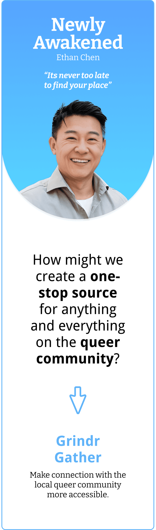
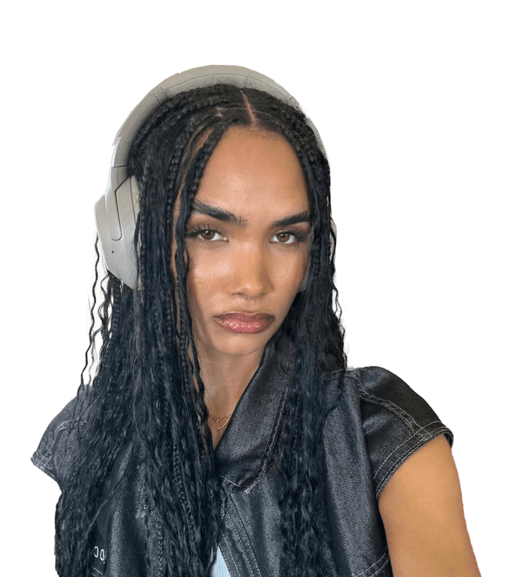
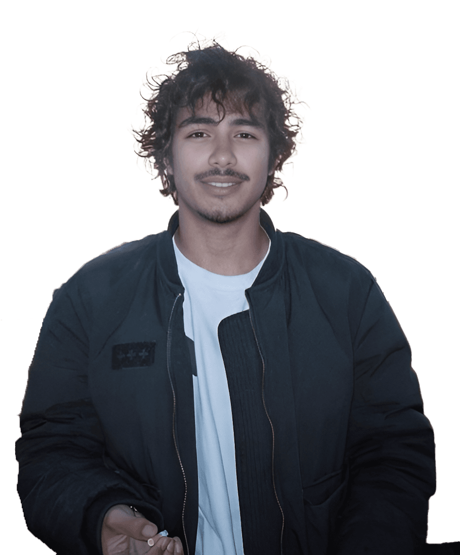
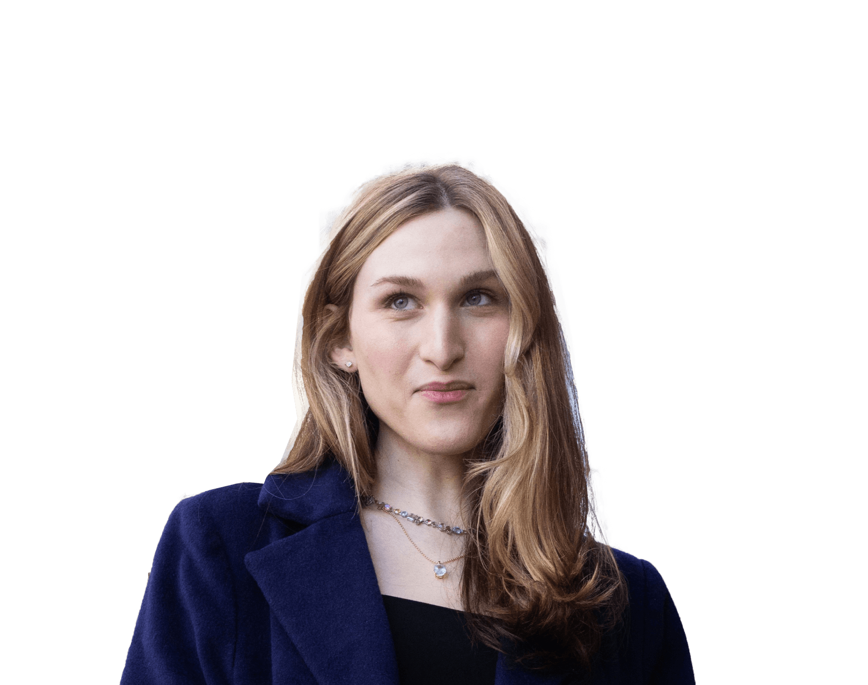
Newly Awakened

Ethan Chen

“Its never too late to find your place”

How might we create a one-stop source for anything and everything on the queer community?

Grindr Gather

Make connection with the local queer community more accessible.

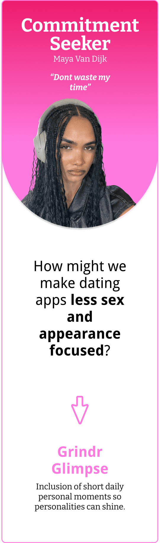
Commitment Seeker

Maya Van Dijk

“Dont waste my time”

How might we make dating apps less sex and appearance focused?

Grindr Glimpse

Inclusion of short daily personal moments so personalities can shine.

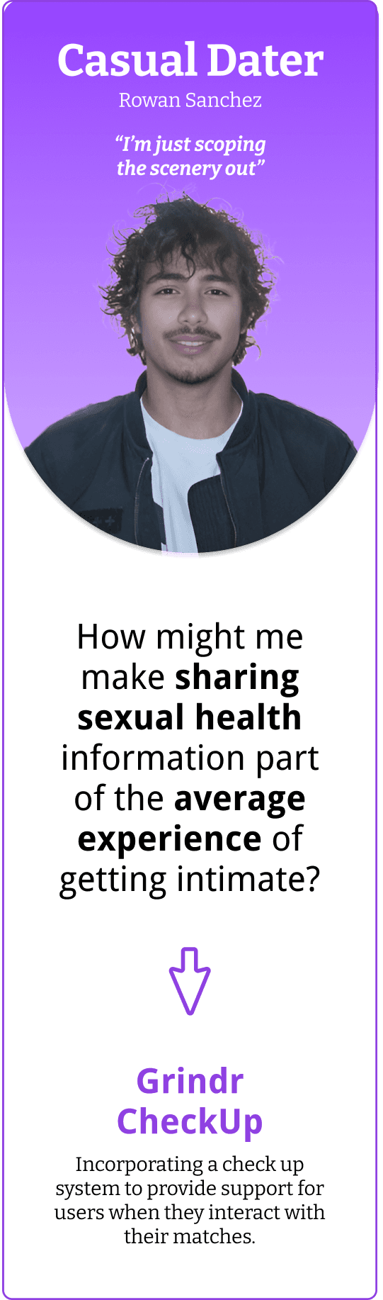
Casual Dater

Rowan Sanchez

“I’m just scoping the scenery out”

How might me make sharing sexual health information part of the average experience of getting intimate?

Grindr CheckUp

Incorporating a check up system to provide support for users when they interact with their matches.

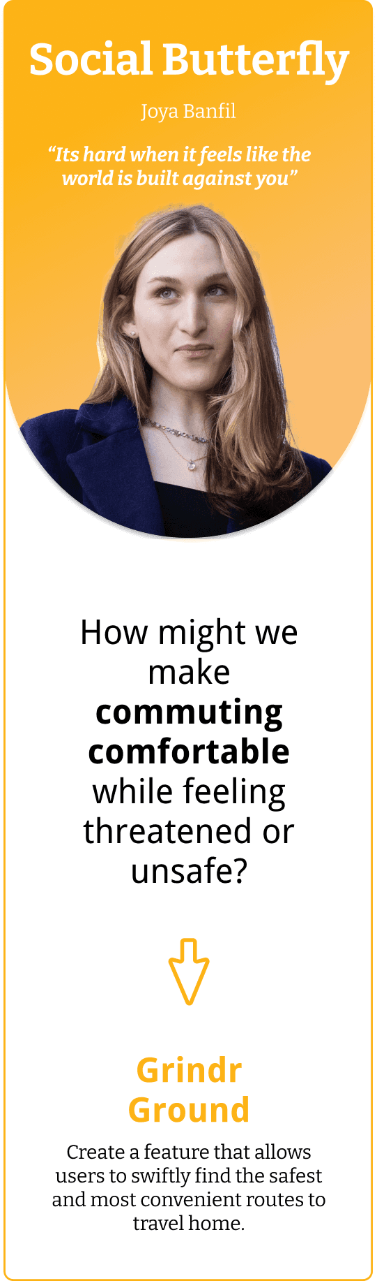
Social Butterfly

Joya Banfil

“Its hard when it feels like the world is built against you”

How might we make commuting comfortable while feeling threatened or unsafe?

Grindr Ground

Create a feature that allows users to swiftly find the safest and most convenient routes to travel home.

Design System

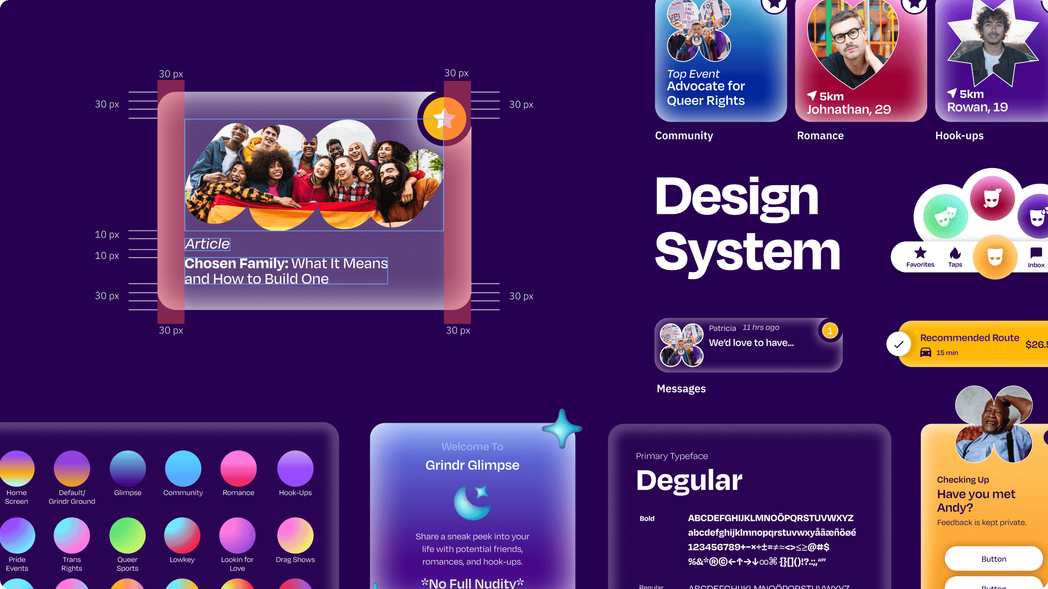
My Role

To build and input a functional design system for the Grindr app UI redesign.

Initial UI

Initial UI

Initial UI

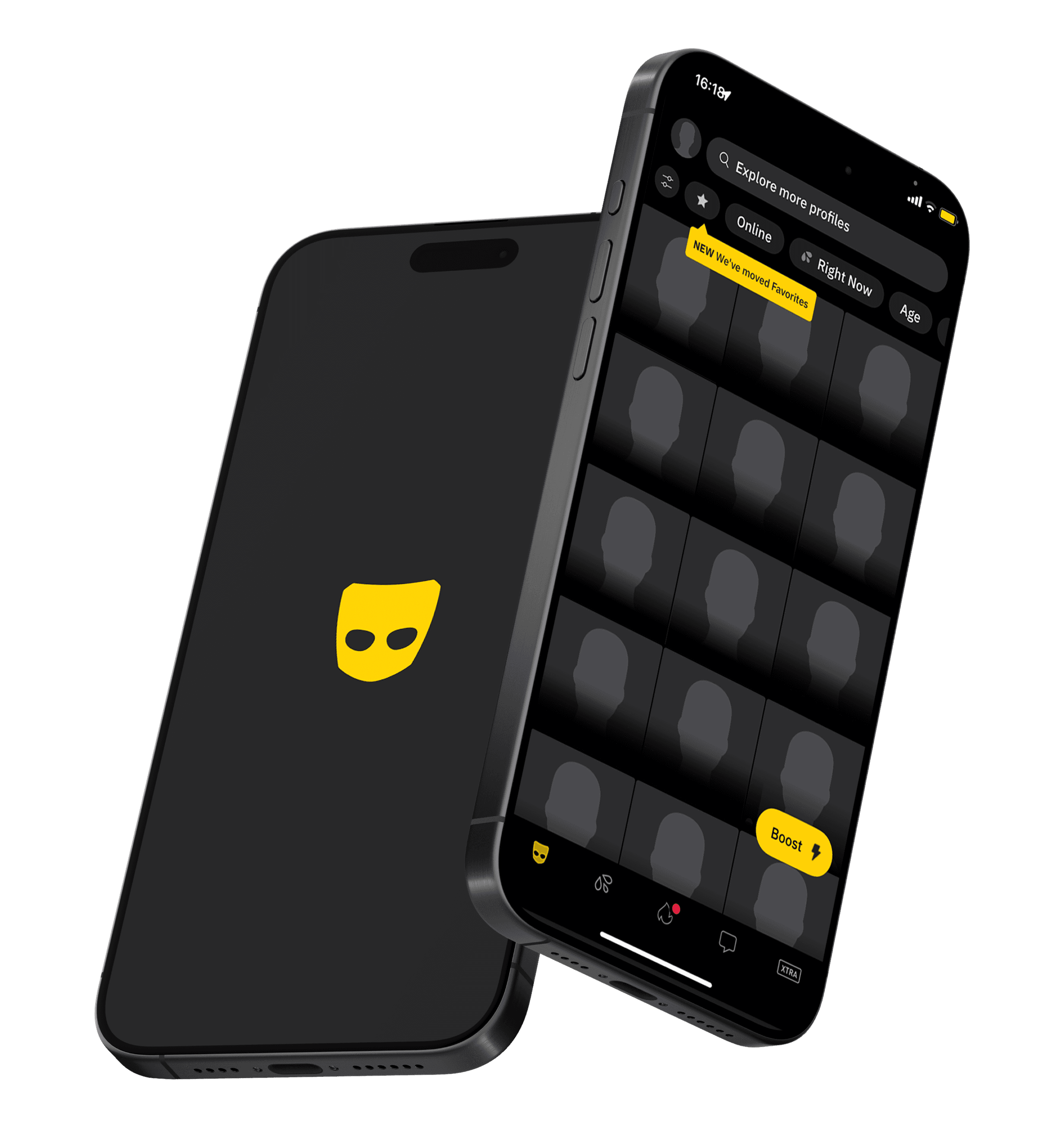
Grindr's UI had a cluttered and ad-heavy appearance, with minimal color and an unfriendly experience. This is what inspired us to change the system.
What Wasn't Working

What Wasn't Working

What Wasn't Working

The original UI redesign was an exploration, which resulted in the many accessibility issues including:
-low color contrast
-lack of solidified design system
-no proper component and type scale usage

My Changes

My Changes

My Changes

As the design system designer, I was handed off the project to input a design system in an established design style. To improve the accessibility while maintaining the integrity of the original design I decided to:

Adjust and limit color usage for better contrast while preserving UI design integrity

Repopulate design with component cards and buttons

Solidify grid design with exact sizing

A Figma Design System

A Figma Design System

A Figma Design System

In order to make the system as effective as possible, I utilized Figma capabilities to componentize all cards, buttons, and icons as well as enforcing the structure of the UI with auto layout. I embedded a proper type scale and simplified the nav bar while preserving the original aesthetic.

Proposed Features

New Modes

New Modes

New Modes

We divided Grindr into three new modes based on what the user was seeking.

Community

A secure and trustworthy color envoking dependability and peace — the ideal community traits.

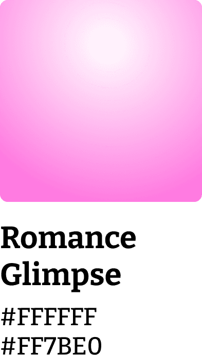
Romance

Compassion and warmth, encouraging an emotional softness and gentle affection.

HookUps

A mysterious color that entertains possibilities and intrigues the mind.

Icon Expansion

Icon Expansion

Icon Expansion

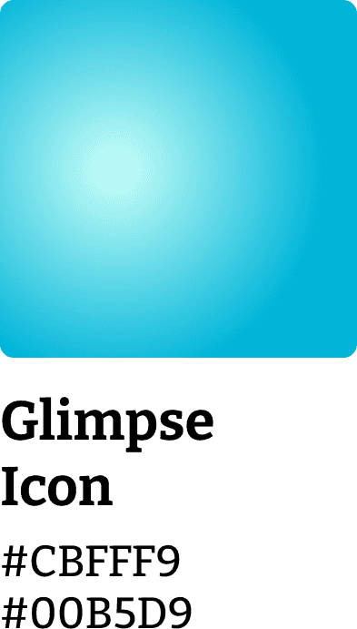
To accompany the new modes, the original icon was reimagined into new designs to assist users in navagating the new features.

A New Look

A New Look

A New Look

Each mode has its own color palette and iconography, making it easy for the user to distinguish.

Community

Romance

HookUps

Community

Romance

HookUps

Navigation

Navigation

Navigation

A newly designed nav bar that includes the new available modes based on what type of connection the user is seeking.

Onboarding

Onboarding

Onboarding

A fresh redesign that continues to uphold the functions of the Grindr app and more.

Grindr Gather

Grindr Gather

Grindr Gather

Make connection with the local queer community more accessible.

Grindr Check Up

Grindr Check Up

Grindr Check Up

Incorporating a check up system to provide support for users when they interact with their matches.

Grindr Glimpse

Grindr Glimpse

Grindr Glimpse

Inclusion of short daily personal moments so personalities can shine.

Grindr Ground

Grindr Ground

Grindr Ground

Create a feature that allows users to swiftly find the safest and most convenient routes to travel home.

Takeaway

What I Learned

What I Learned

User testing is everything

User testing is a key part of solidifying a user task flow and bringing the design into the higher fidelity phase.

Language is important

Apart from visual hierarchy, wording helped users use the app intuitively without confusion and prevent invasive prompting.

Empathy interviews give direction

We were able to expand our views of what problems needed to be fixed for the intended user.

User testing is everything

User testing is a key part of solidifying a user task flow and bringing the design into the higher fidelity phase.

Language is important

Apart from visual hierarchy, wording helped users use the app intuitively without confusion and prevent invasive prompting.

Empathy interviews give direction

We were able to expand our views of what problems needed to be fixed for the intended user.

Next_Up_

Skullcandy_

Holi_Babies_