Skull_Candy_
Skullcandy is an American company that sells quality audio technology such as headphones, speakers, and earphones. They allow high end technology to integrate into everyday life no matter the lifestyle. However, they lack graphic elements and relies heavily on photography to secure brand identity.
Solution: Rearrange product display page to highlight important information above the rest of the websites features and solidify visual identity.
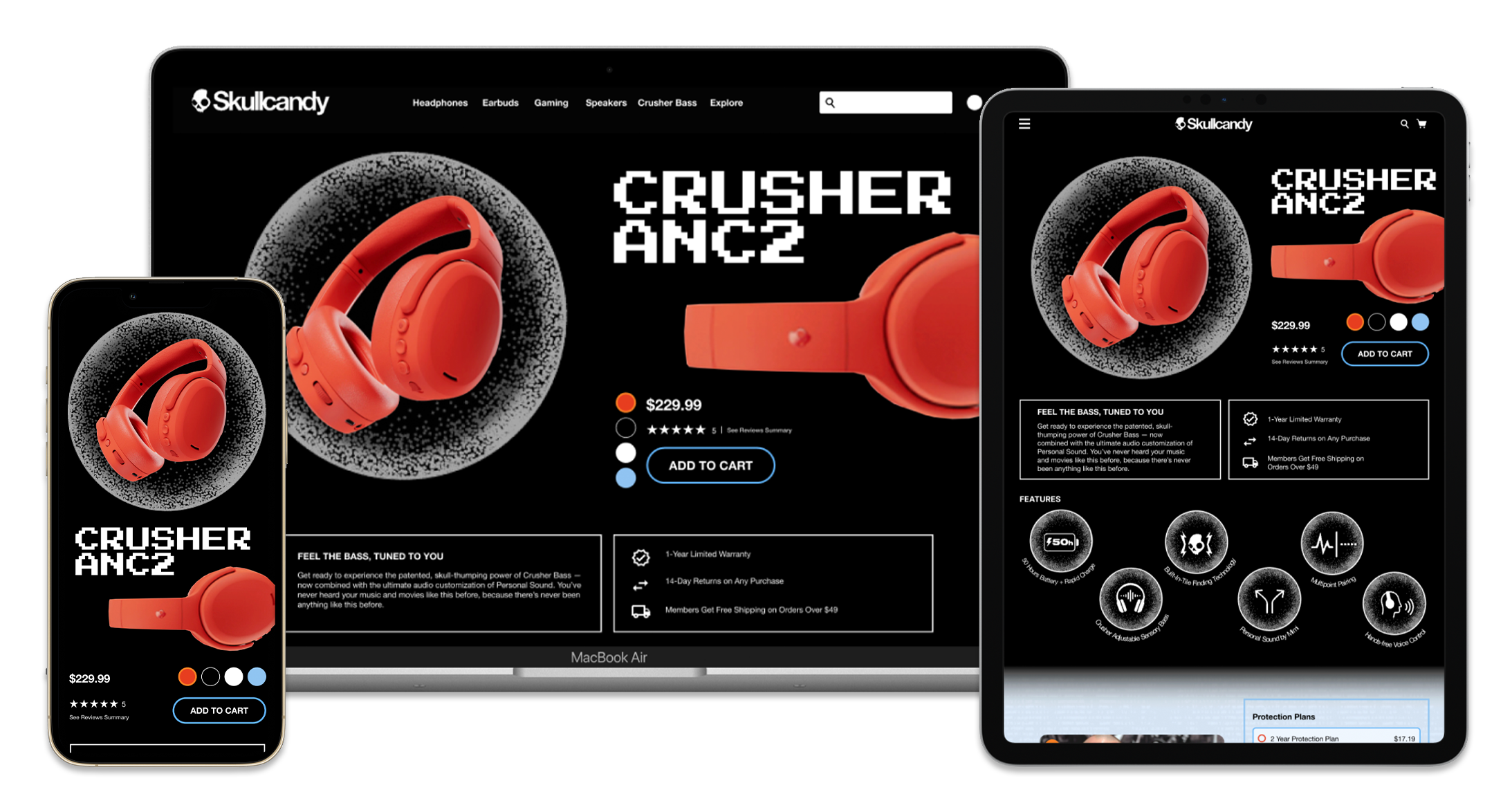
Product Display
Product Details
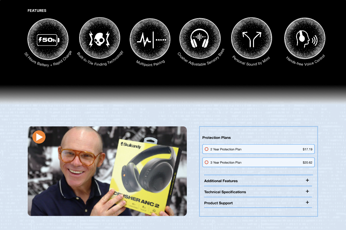
Celebrity endorsement featuring the product
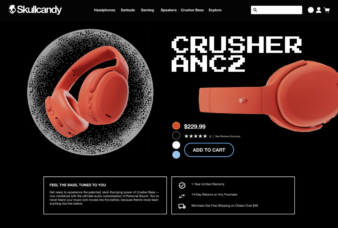
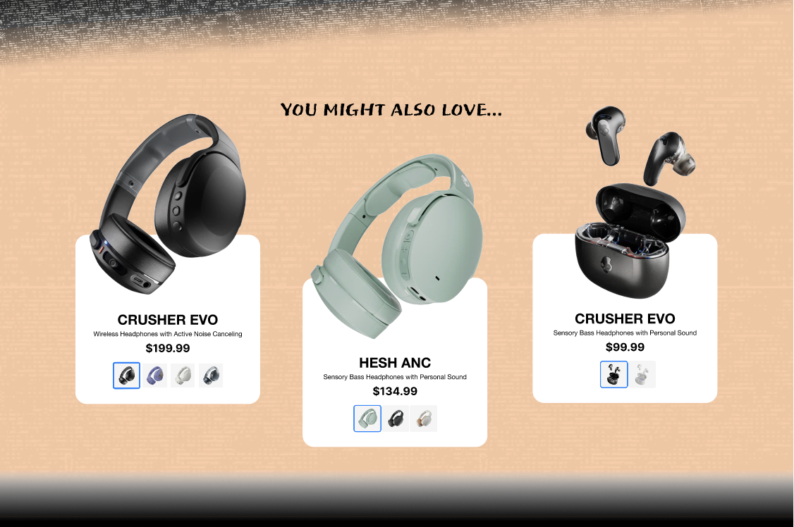
Simpler yet informative display of other product options.
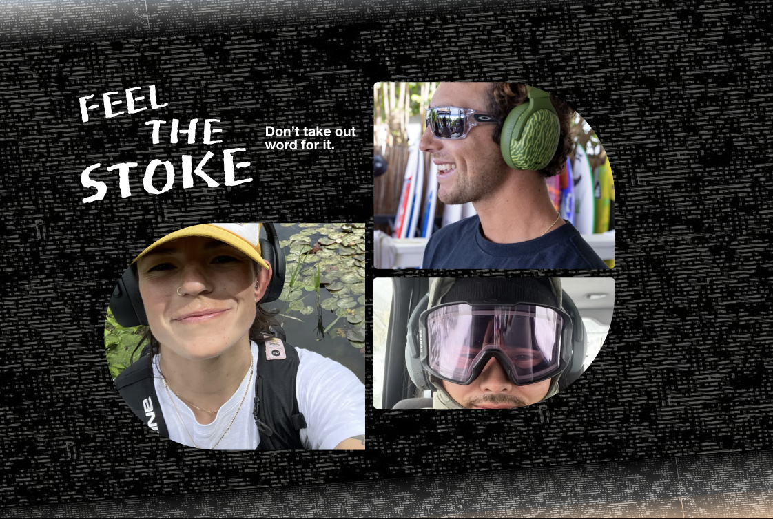
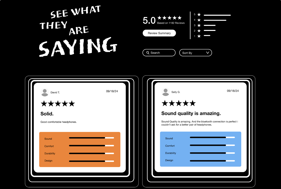
Overview of general product sentiment in regards to certain aspects.
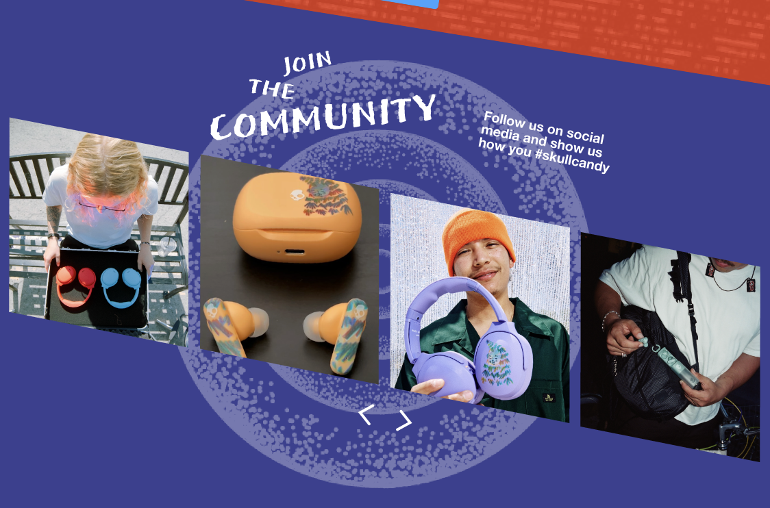
Captivating social media shout out.
MSG_Rebrand_
Madison Square Garden is a world-renowned indoor arena in the heart of New York City. However, the current identity is outdated and lacks the ability to stand out from competitors.
This project was a collaborative effort of four FIT students: - Cecilia Garcia Pizales - Thalia Merino - Gina Lee - Shalika Thappali
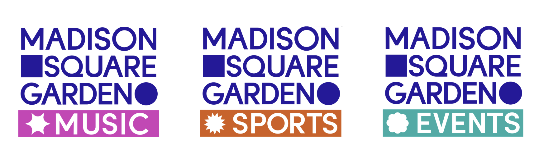
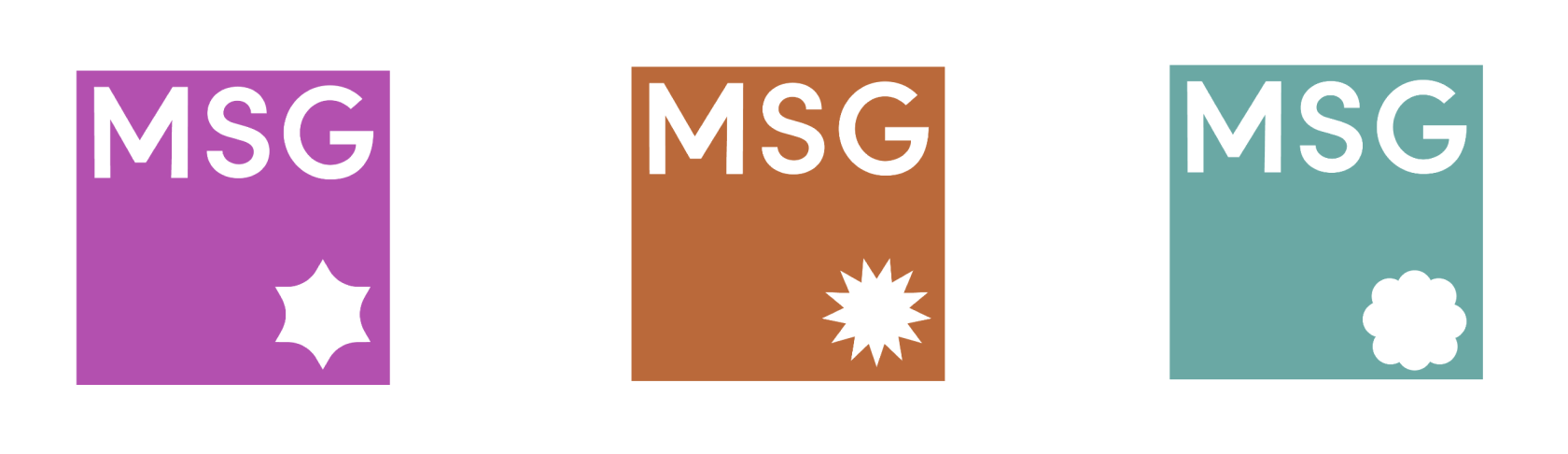
Logo
MSG's newly designed logo is constructed with a square, representing Madison Square Garden's first arena, and the circle, representing Madison Square Garden's current arena.


Dynamic System
MSG's brand identity reflects its grand status as the pillar of entertainment through a modular and interactive brand mark that embodies the excitement of live events.
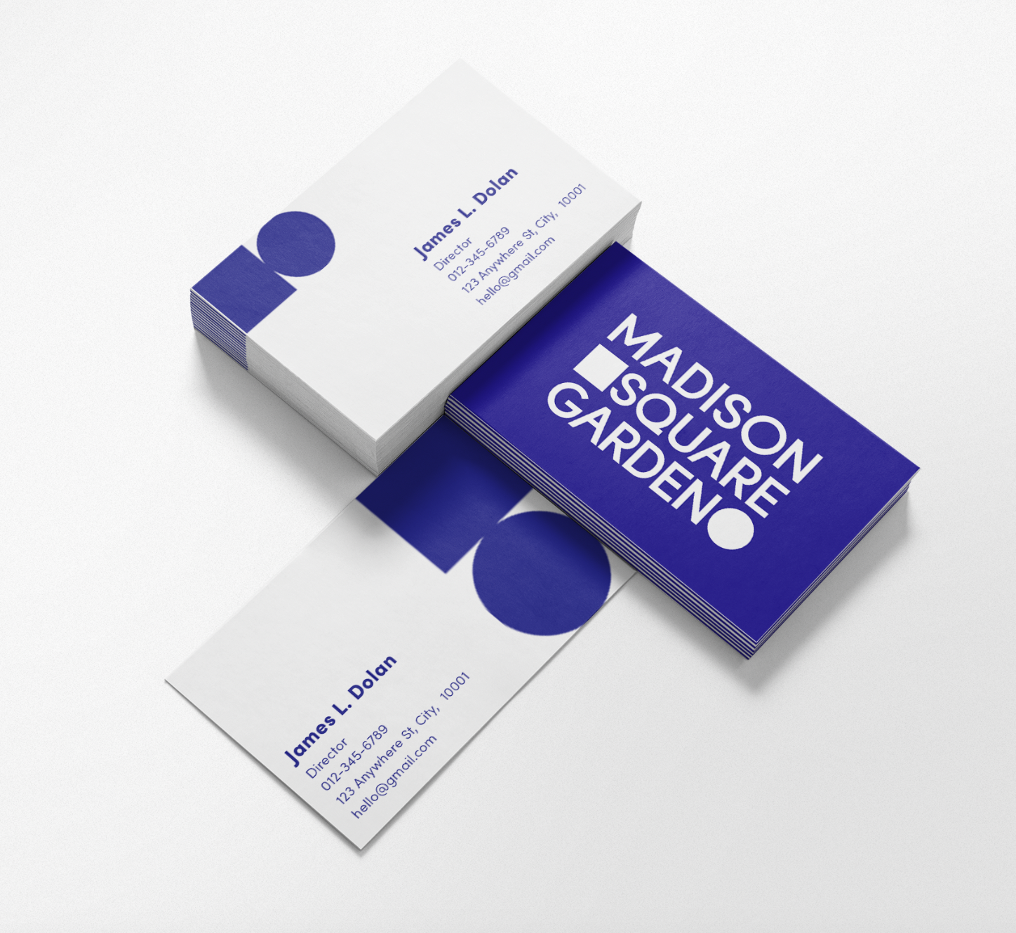
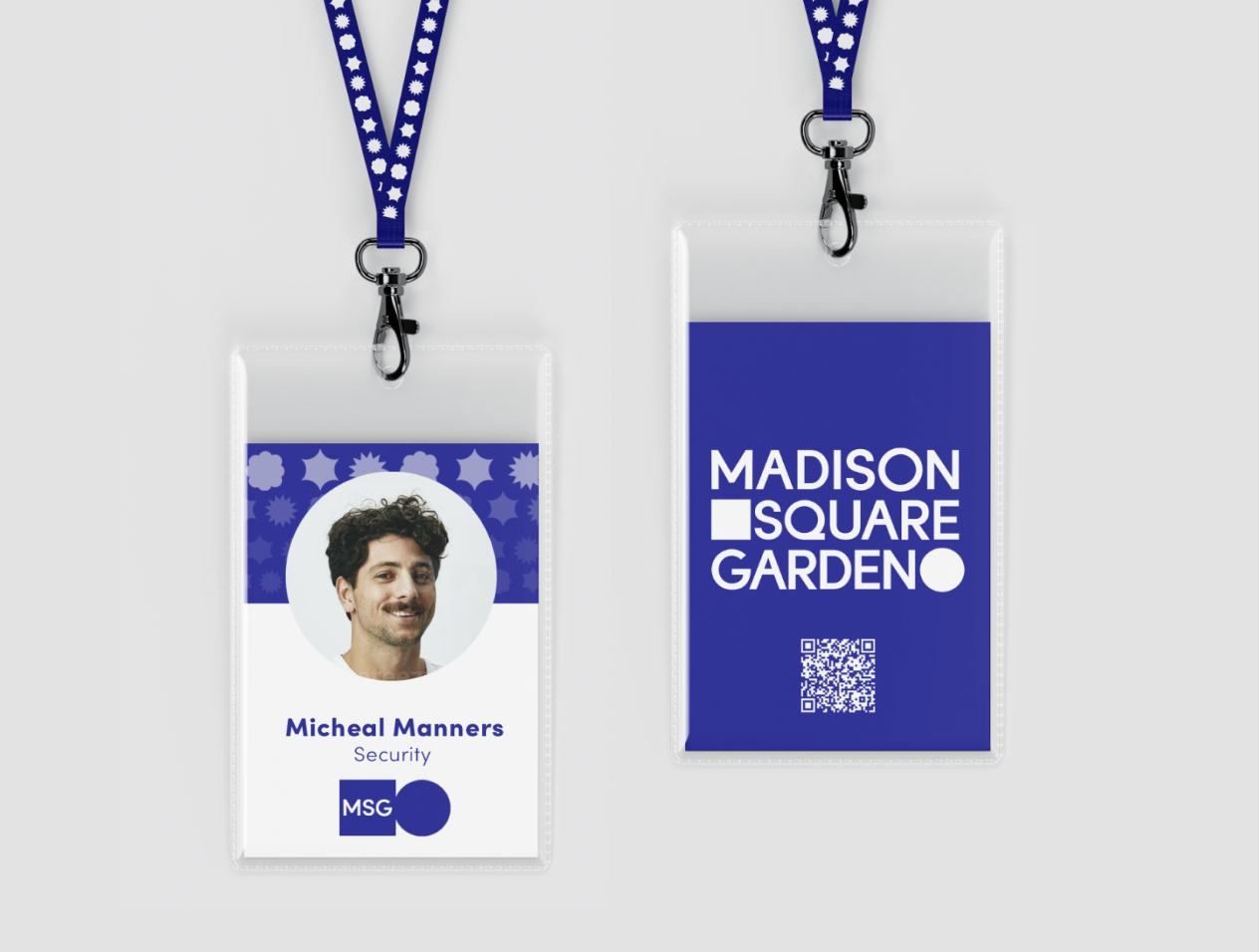
Identity Application
Business cards
Staff ID
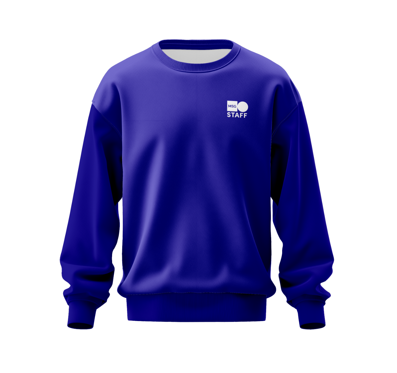
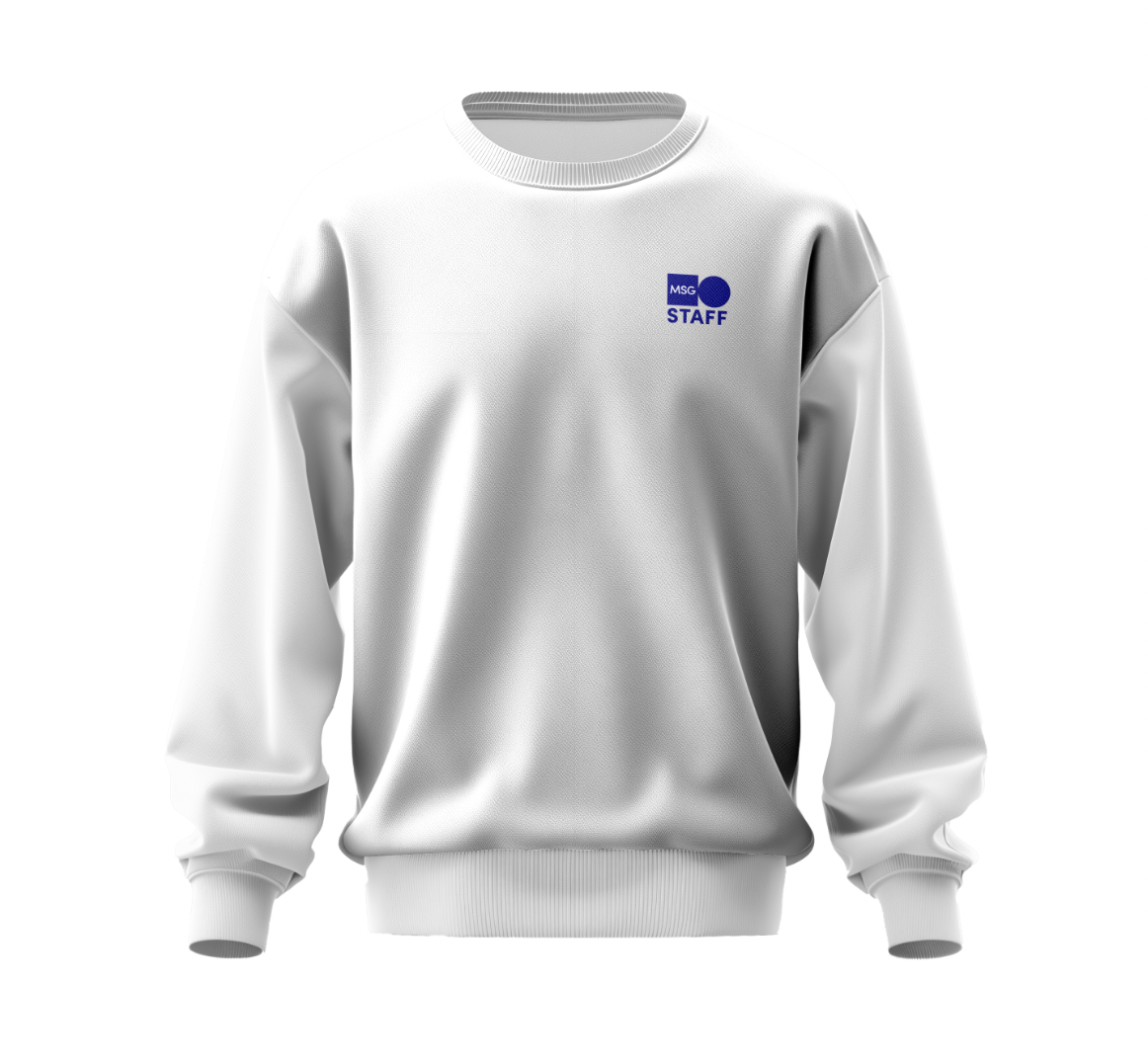
Merchandise/Uniform
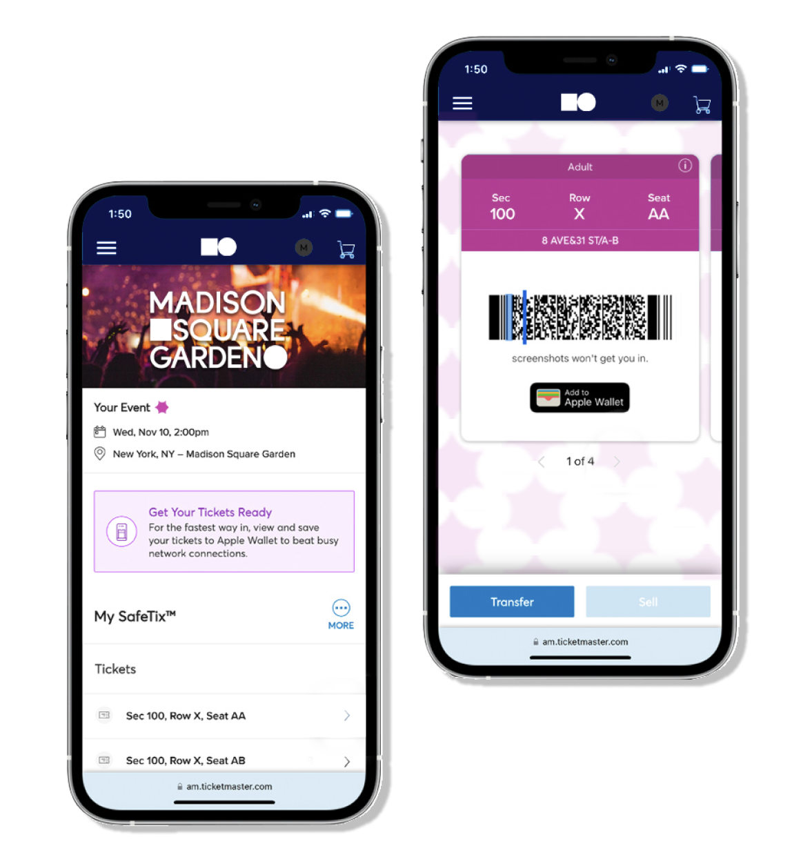
Digital Ticket
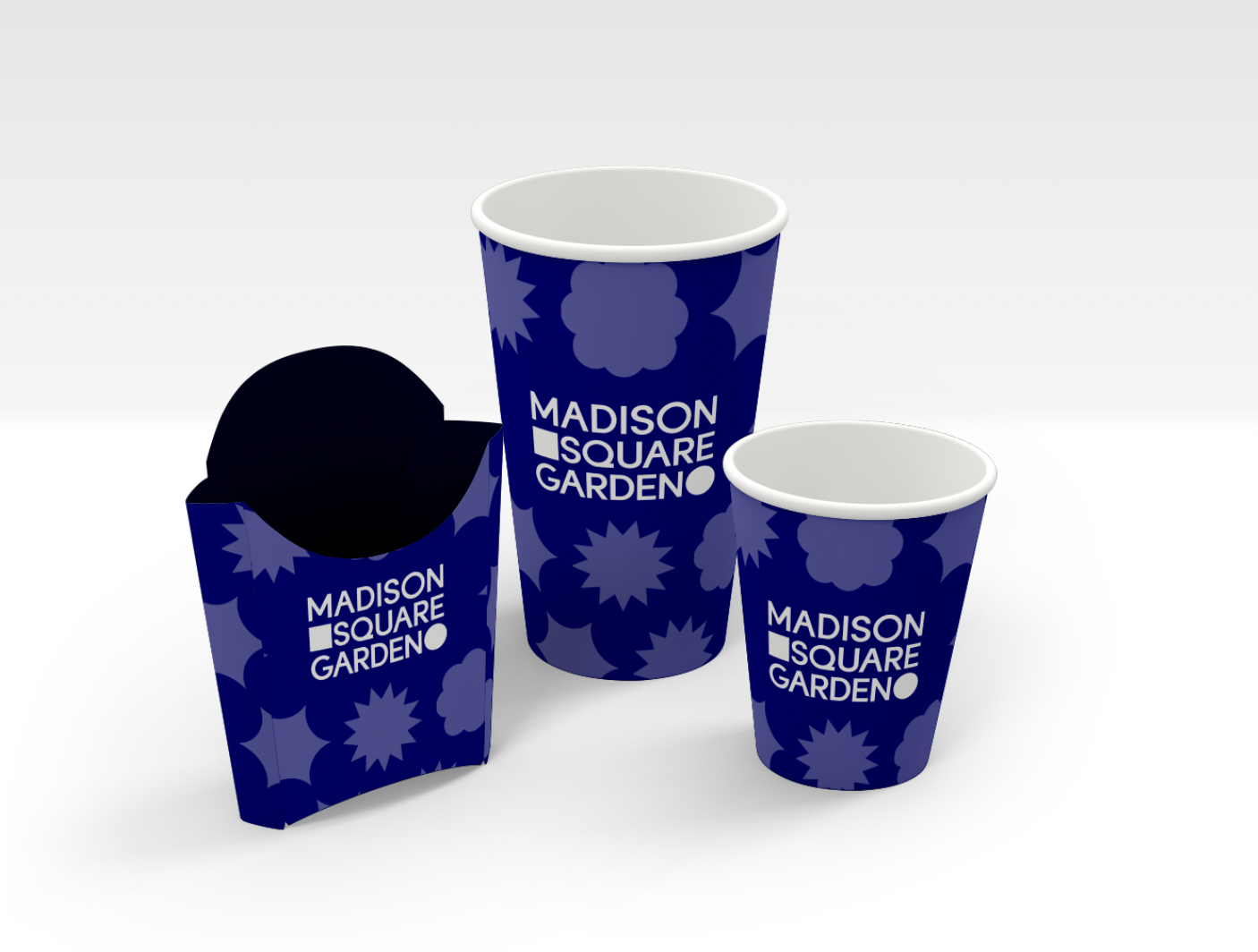
Concessions/Packaging
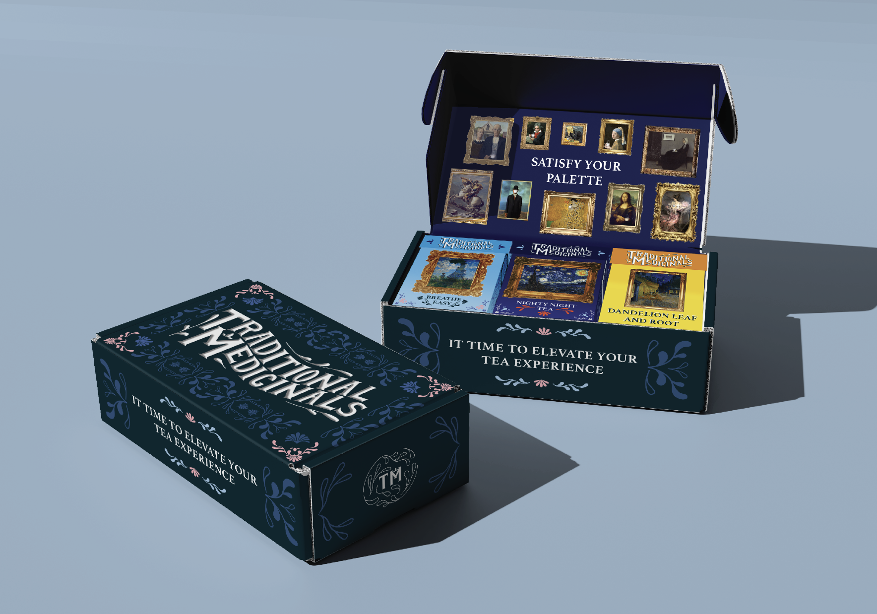
Satisfy_Your_Palette_
In the 60s a herbalist and an environmentalist collaborated in an effort to bring easy remedies and health benefits to the people-thus Traditional Medicinals was born. Prioritizing people and the planet has always been rooted in the company as well as a focus in giving back and investing time and care into each blend.
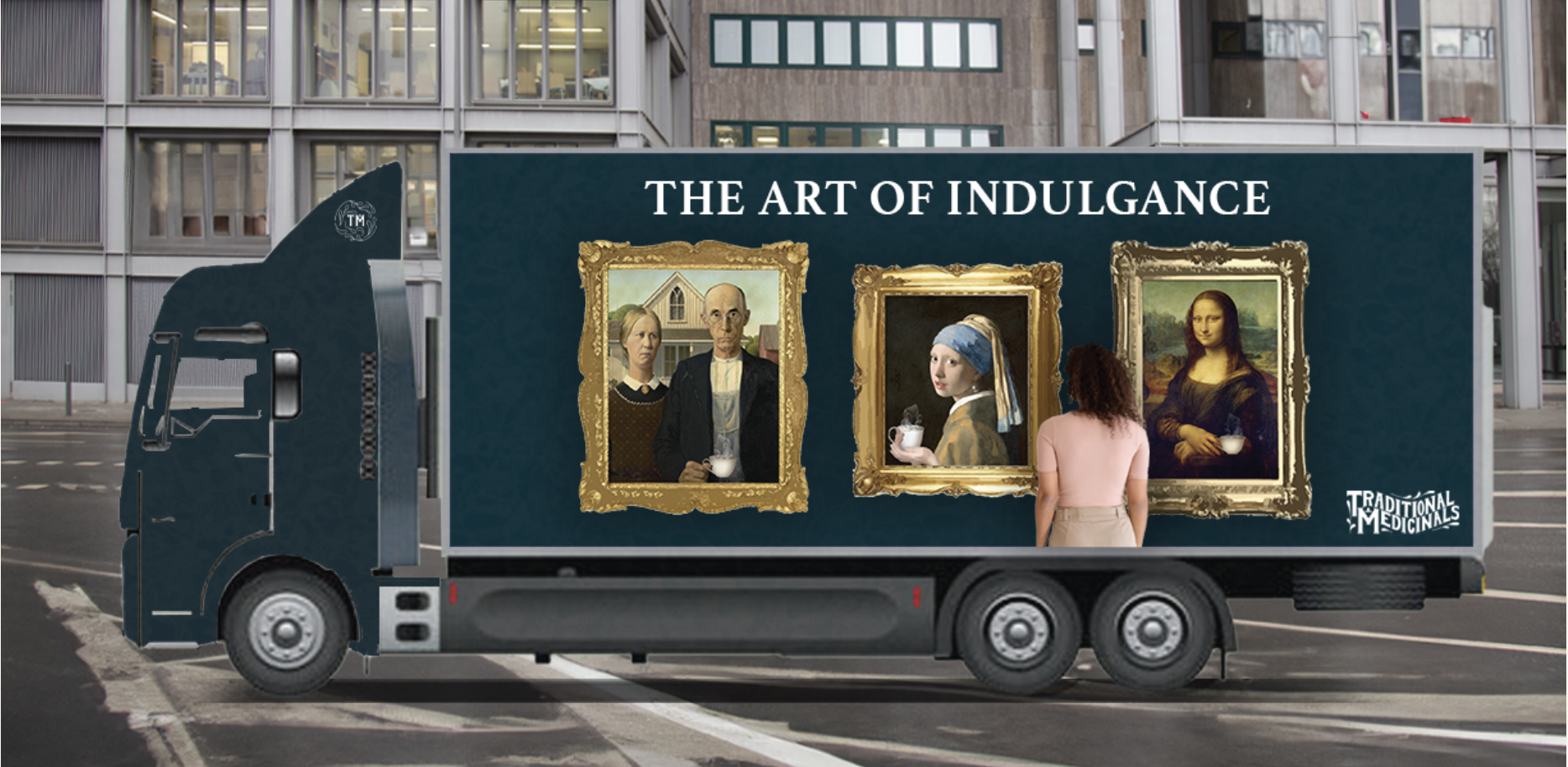
Concept: inspired by the charm and passion behind classic pieces of art.
Case study is avaliable here
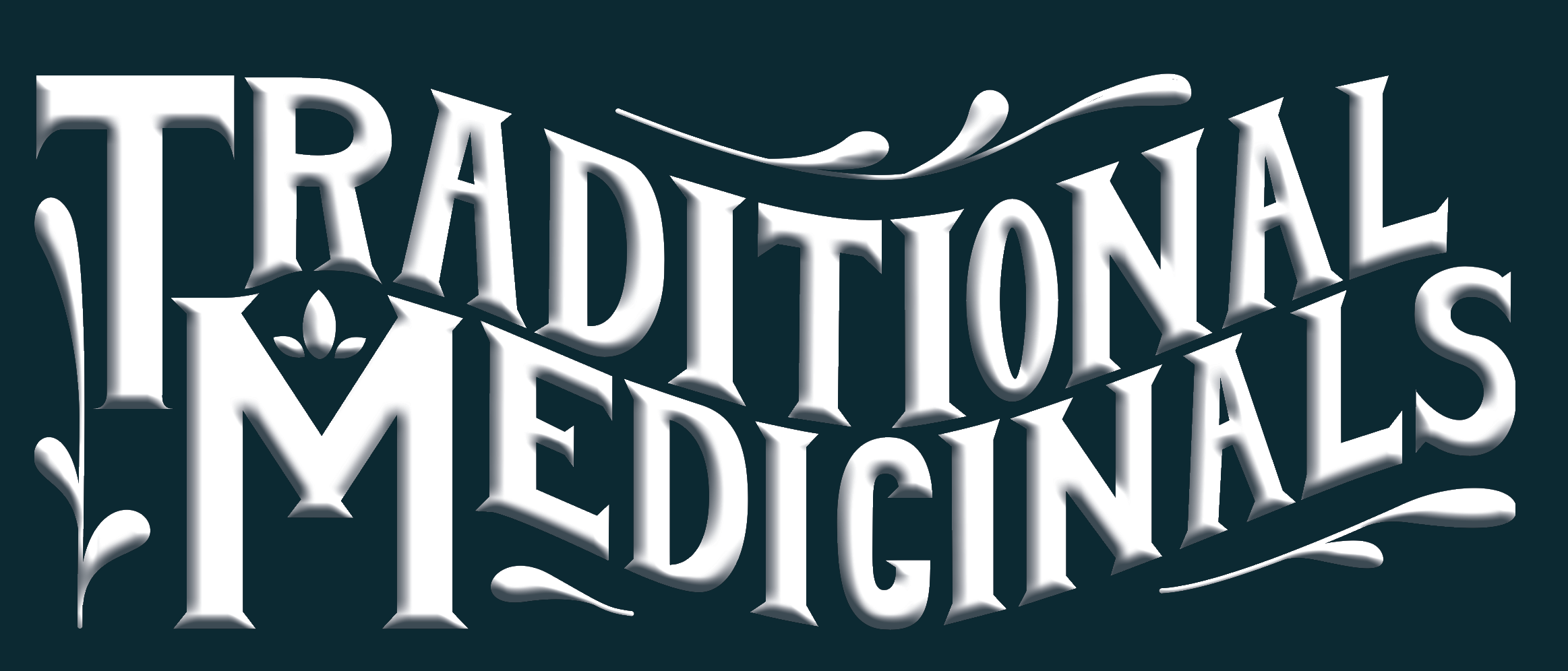
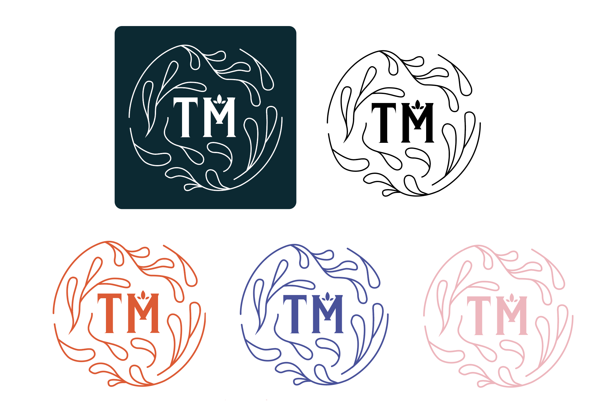
Logo
Using hand-drawn type inspired by vintage typography, plant motifs, and the previous logo, the rebranded logo brings a modern sophistication to the brand while still retaining a vintage feel.
Application
Applying the elements of brand identity will begin the brand introduction to the general public and introduce the new Traditional Medicinals.
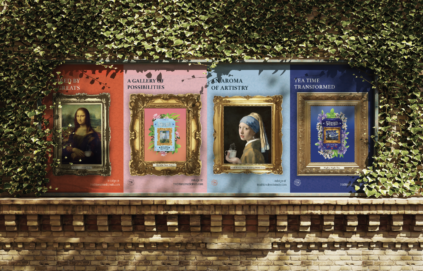
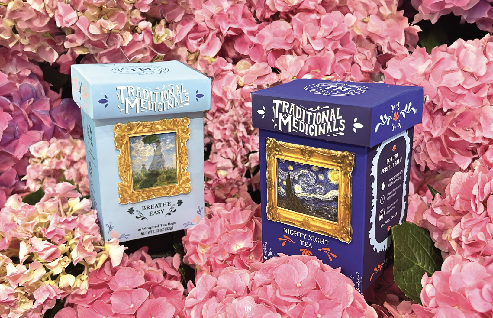
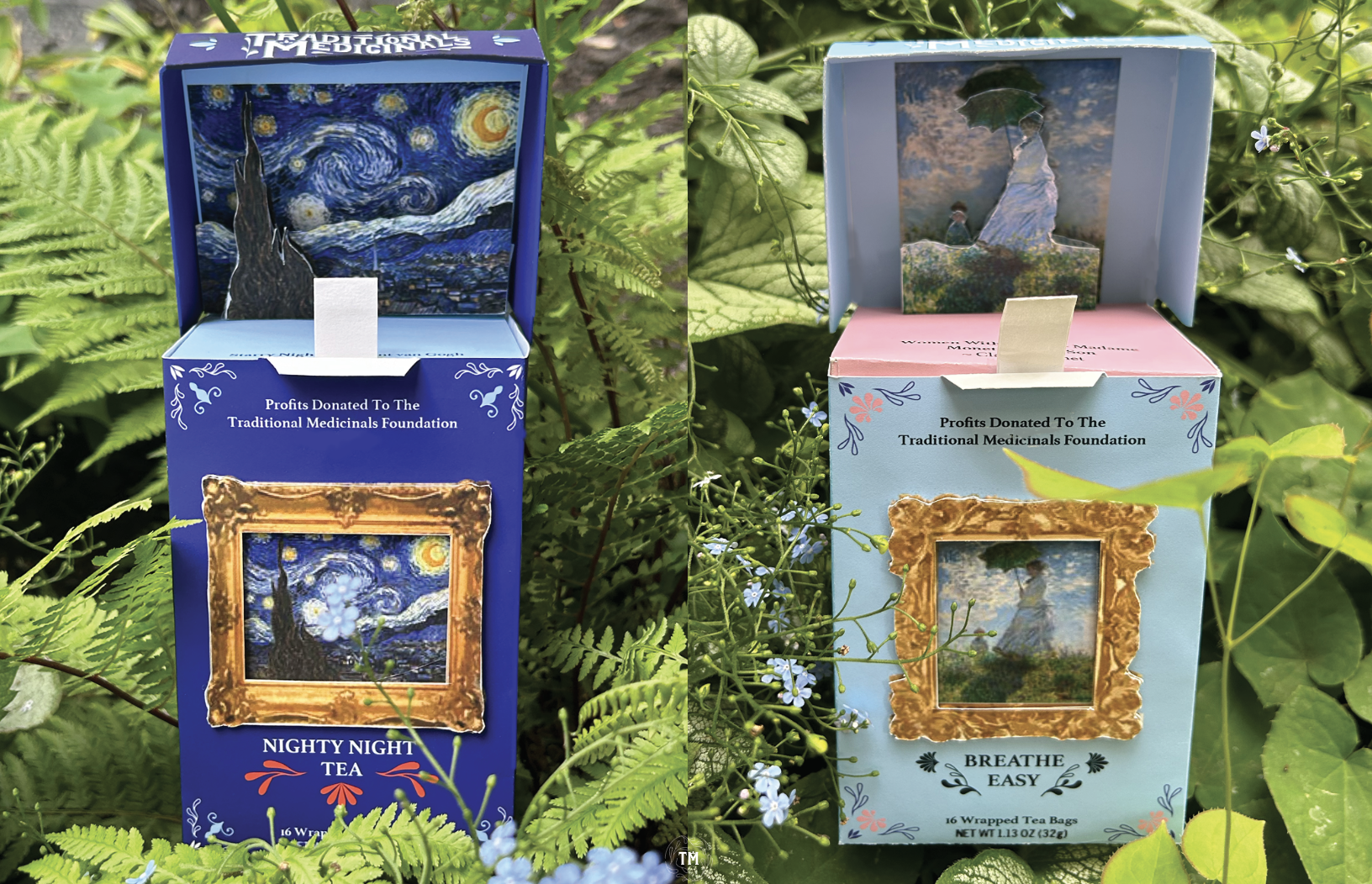
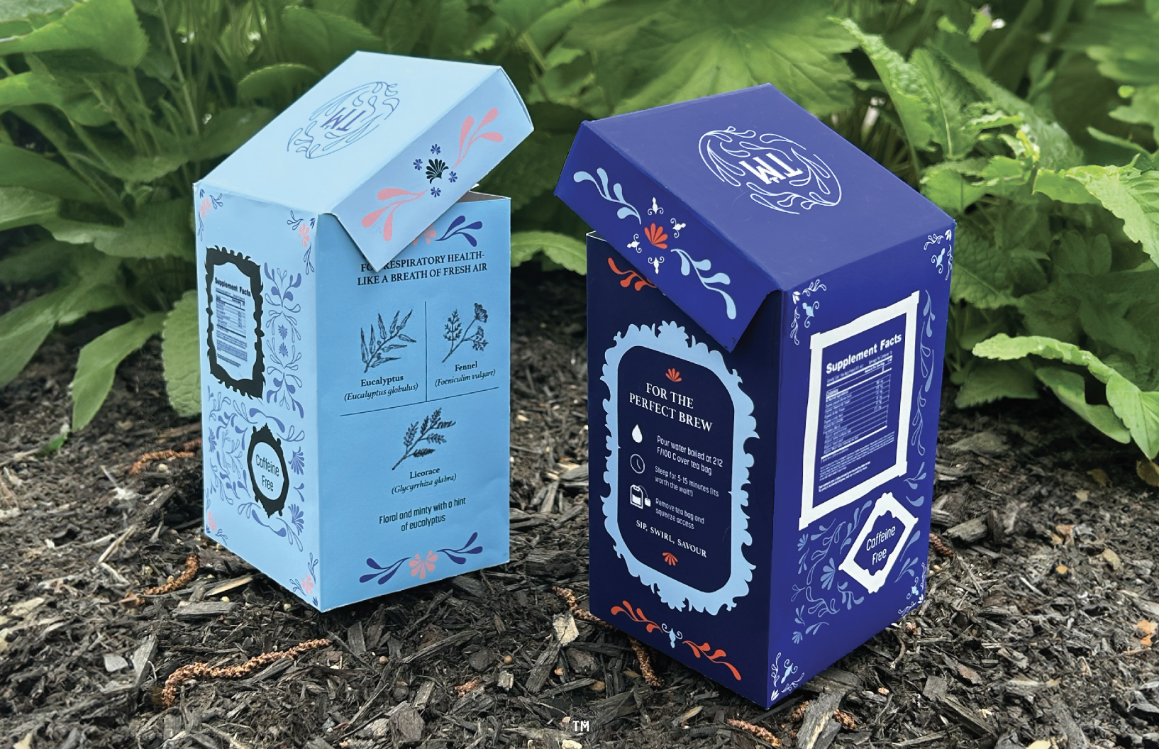
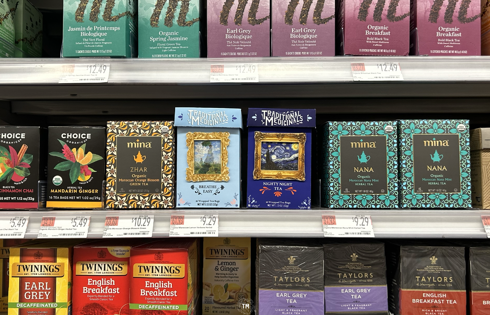
Packaging
The new packaging is elevated and is intended to outshine competitors packaging on the shelf. it directly applies the brand concept to highlight the new direction of the brand.
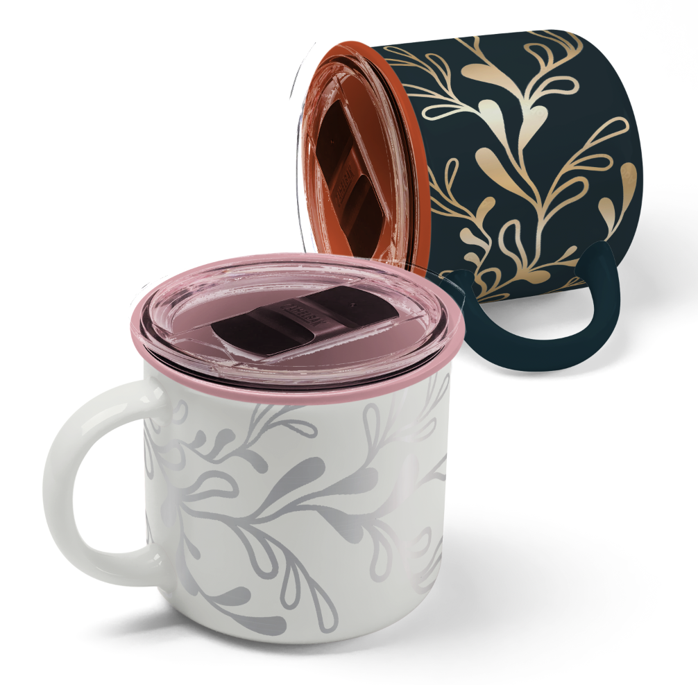
Merchandise
As an added element, merchandise will extend the customers experience with Traditional Medicinals beyond the tea.
Nourish_Your_Community_
GardeNYC is a non-profit community garden and resource aid hub located in South Bronx, NYC. Offering a range of resources including distributing fresh produce around the city, fundraising, outreach programs, and workshops and events to help and aid the community.
Our mission goes beyond delivering produce; we aspire to offer hope and empowerment as we believe everyone deserves the right to a happy and healthy life.
This project was a collaborative effort of six FIT students: - Angelina Ao - Shelby Dresser - Vashtie Persaud - Matthew Rivera - Emerson Schuette - Shalika Thappali
Case study is avaliable here
Logo
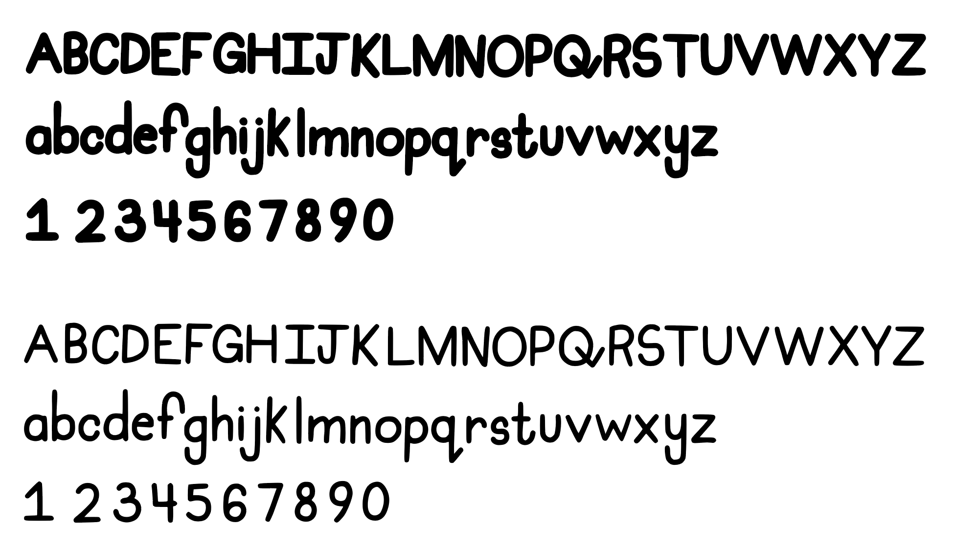
Redesigned typeface to fit the groove of the brand, mimic the NYC skyline, and clarify the pronunciation of the name.
Typography
“GARDENYC SCRIPT” is a whimsical typeface inspired by the hard work that takes place at GardeNYC. Its soft and organic forms evoke the essence of tending to nature, perfectly complementing the garden’s retro aesthetic while also embodying it’s core values of community and inclusivity as it exudes warmth and nostalgia in its rough, handcrafted type design.
Created by Vashtie Persaud.
Website
GardeNYC's website is accessible here
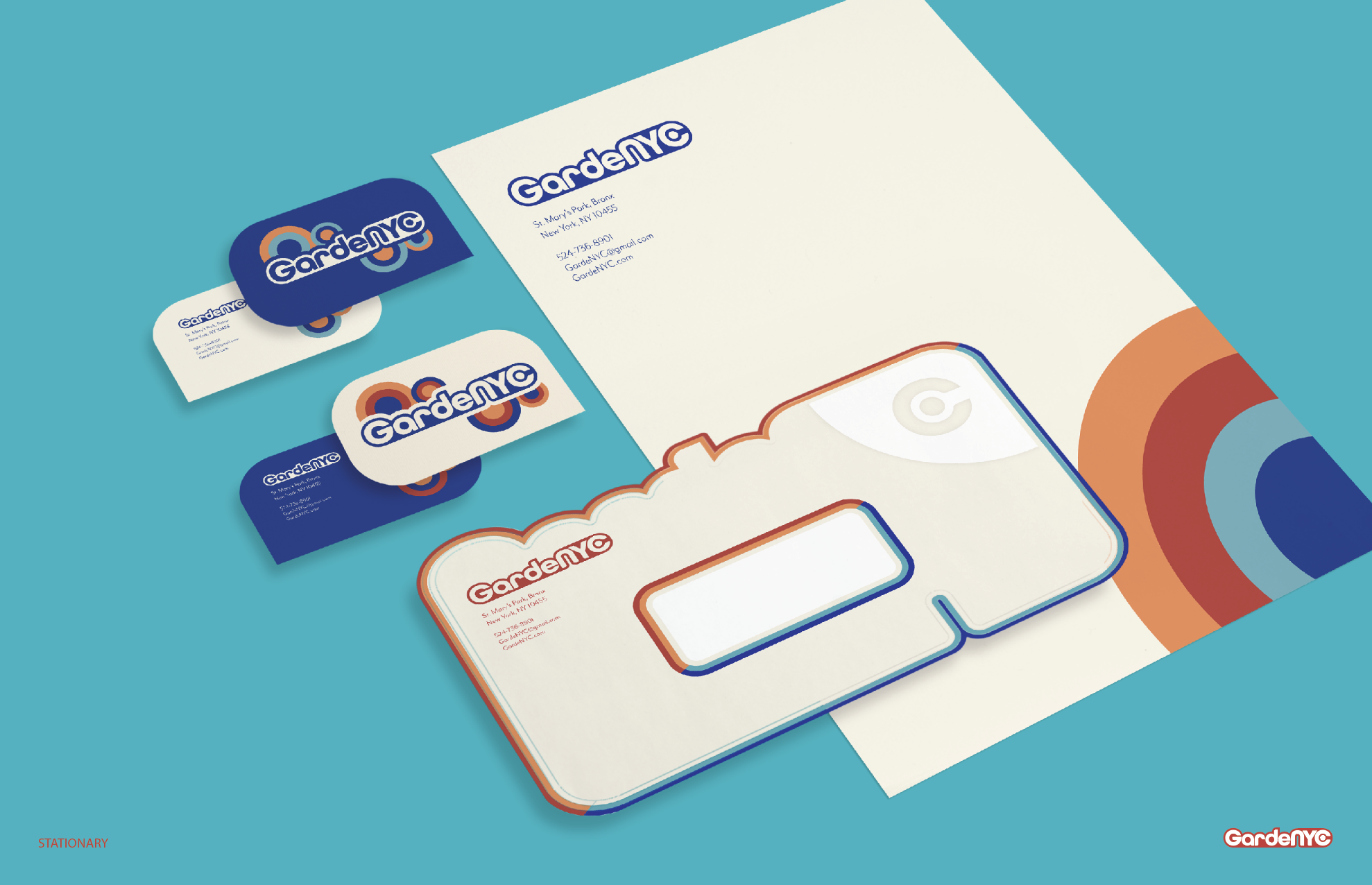
Brand application
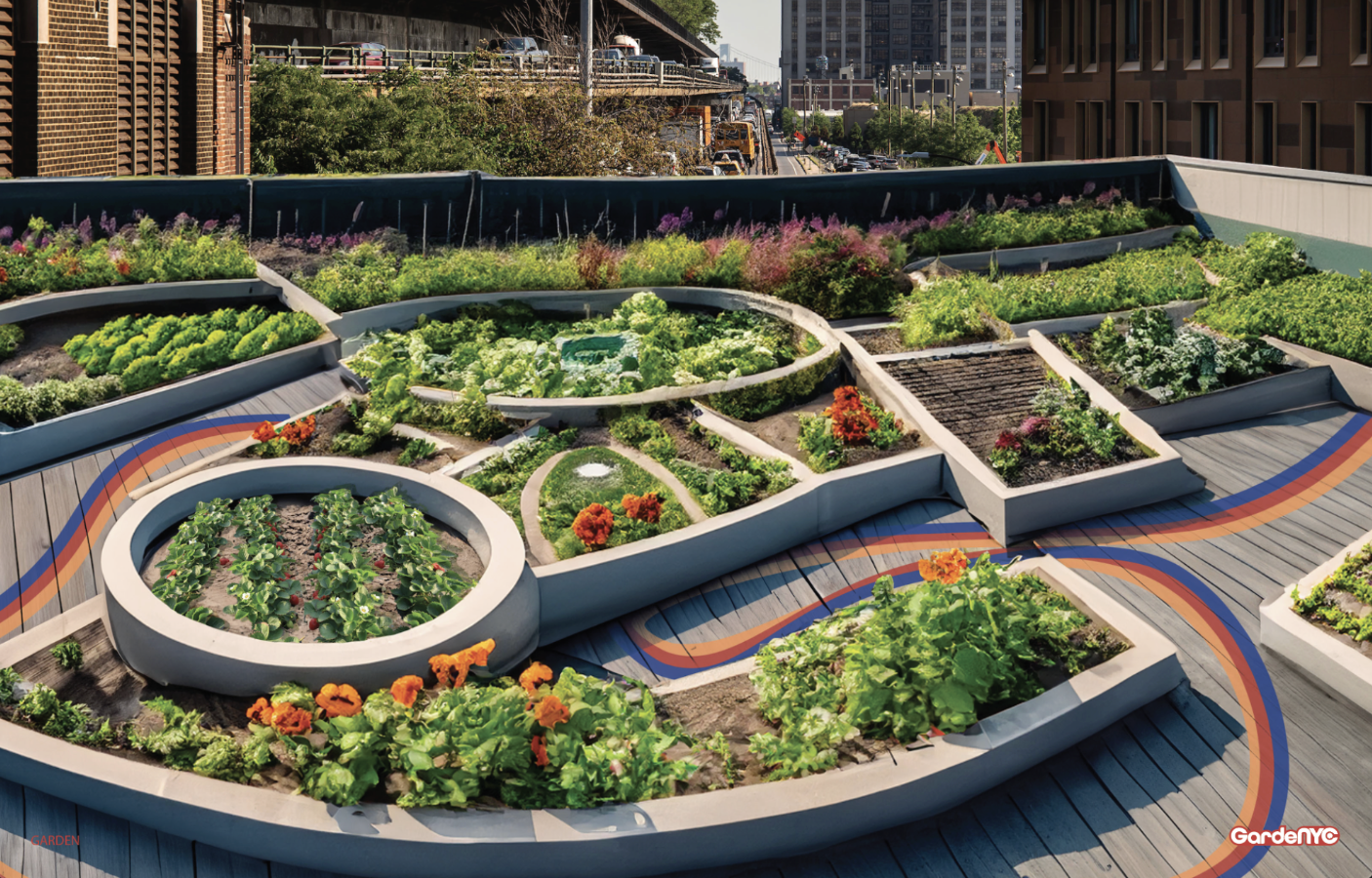
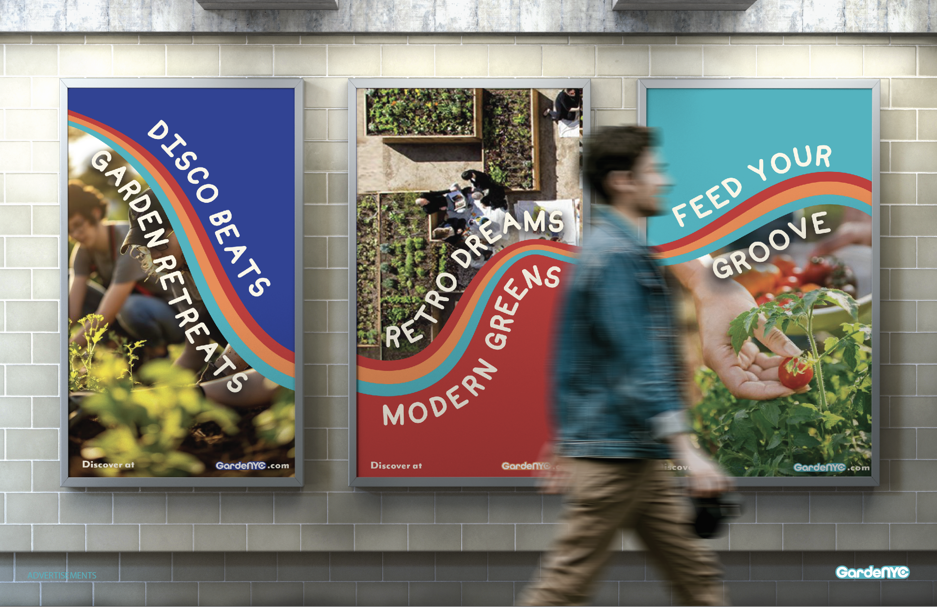
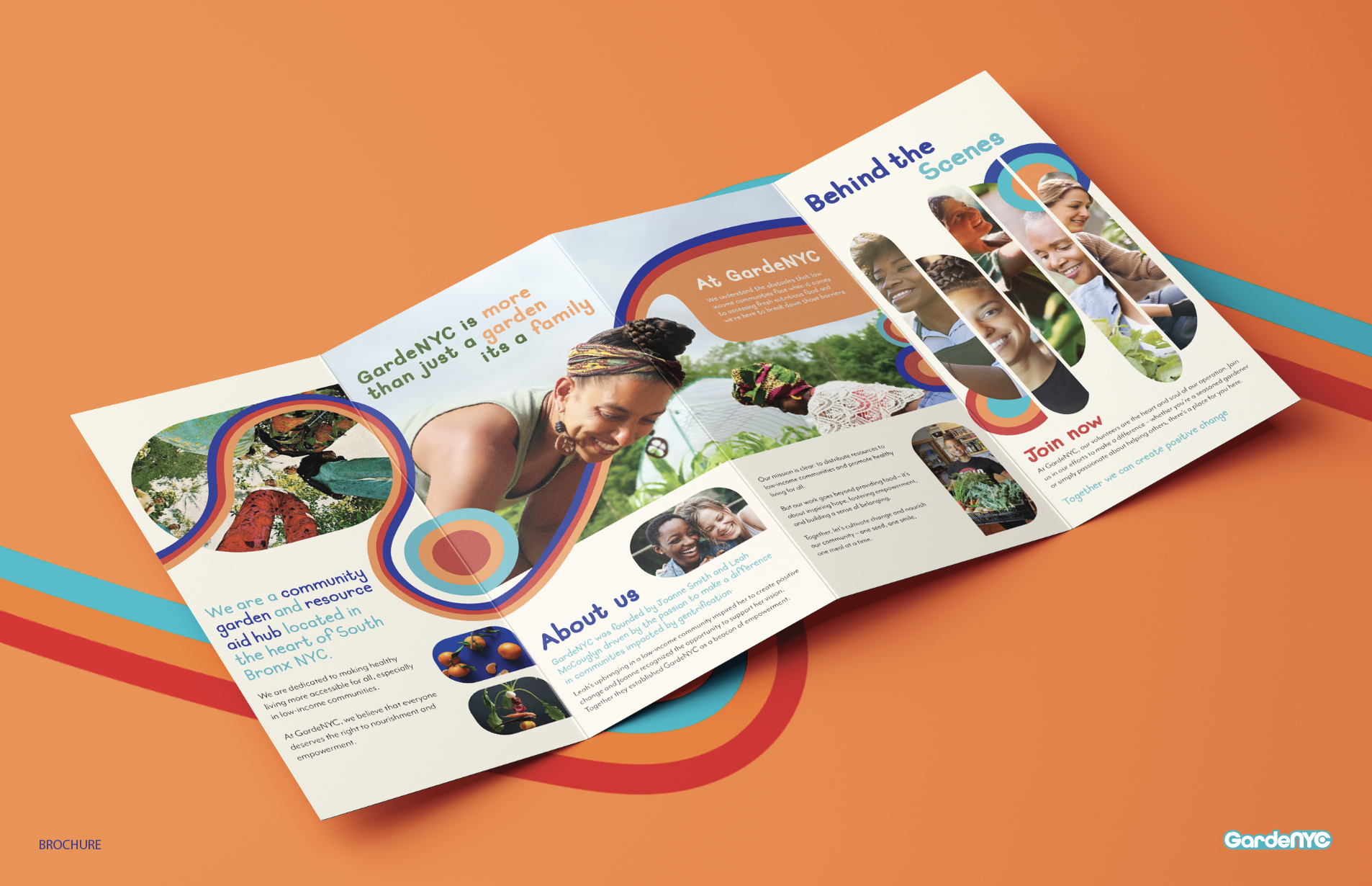
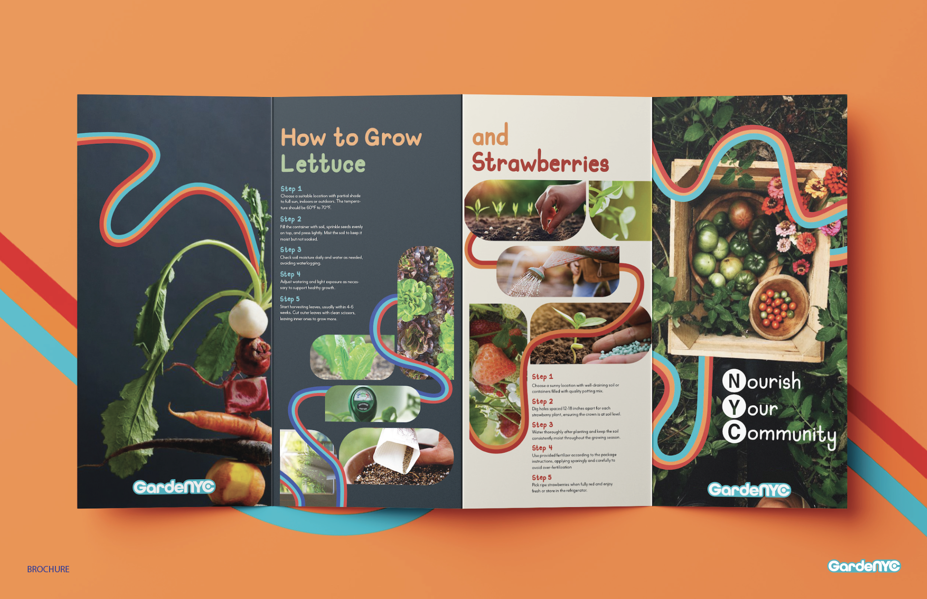
The rendered garden space creates the visual of where GardeNYC would live. Advertisements and a brochure would serve as touchpoints for people to learn about the brand and who we are at GardeNYC.
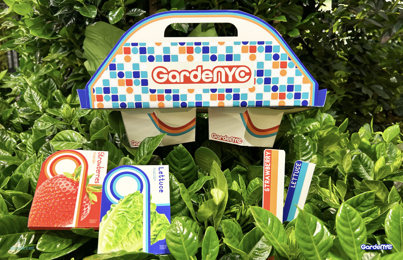
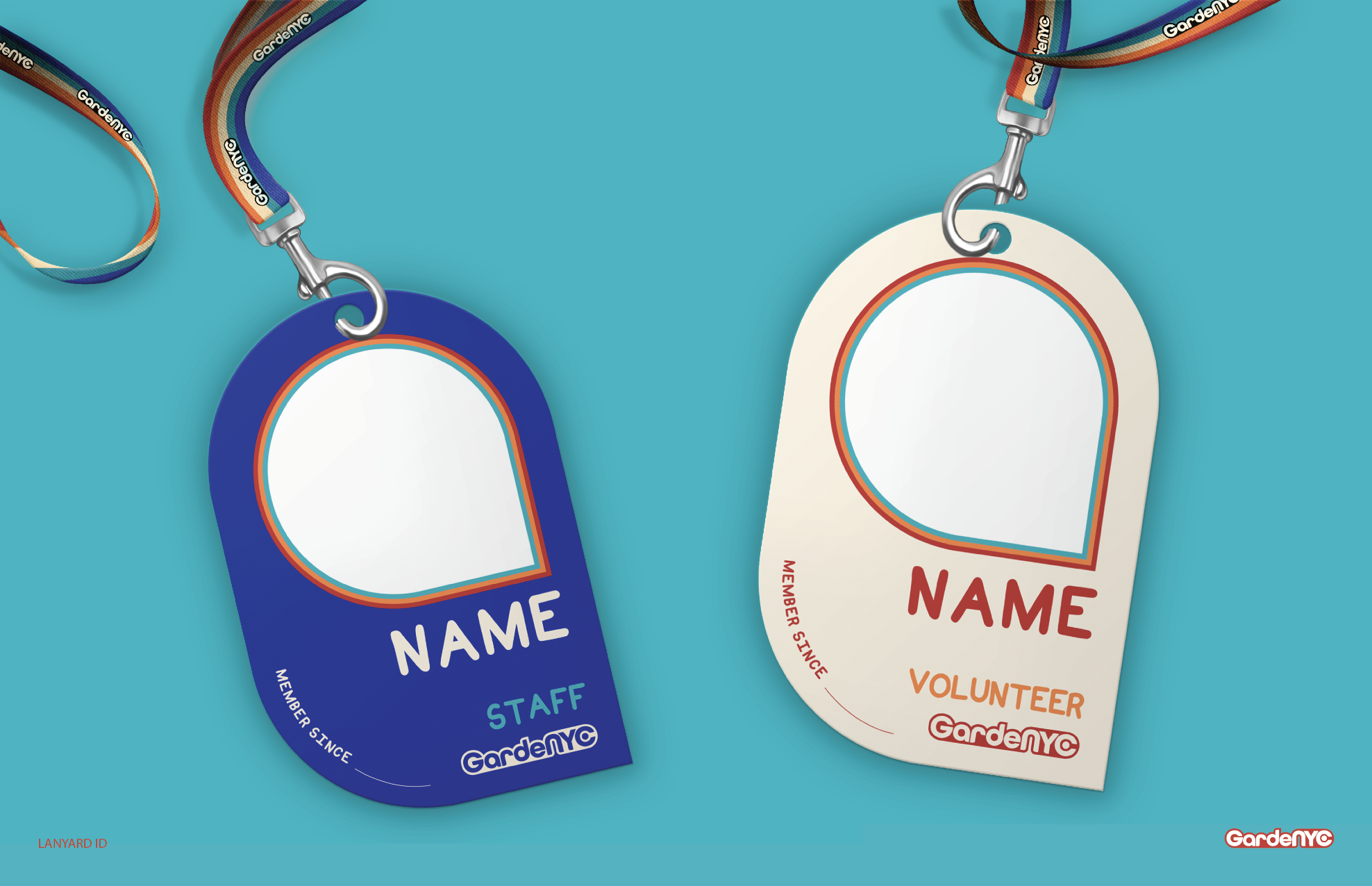
Product
Garden kit packaging, volunteer/employee t-shirts and lanyards, as well as custom sticker designs all utilize the graphic elements and the color palette of the brand.
Miscellaneous_
A collection of posters done in accordance with creative briefs
All posters created using Adobe InDesign and Figma.
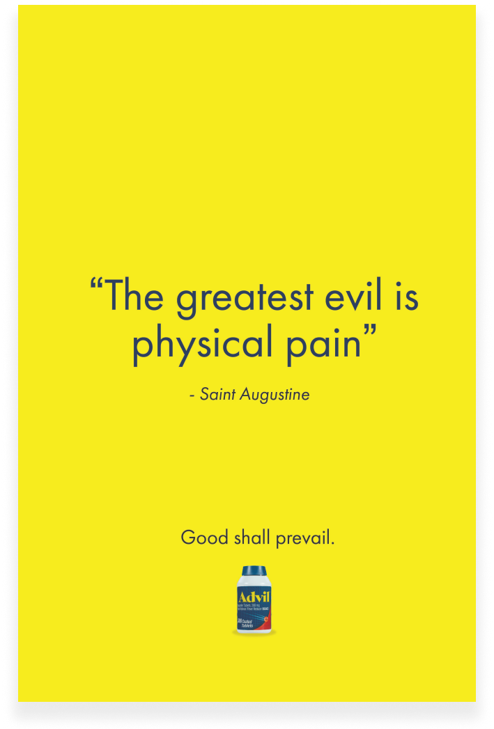
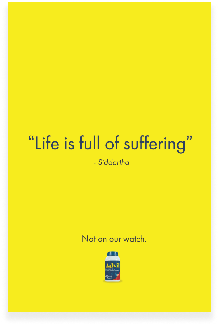
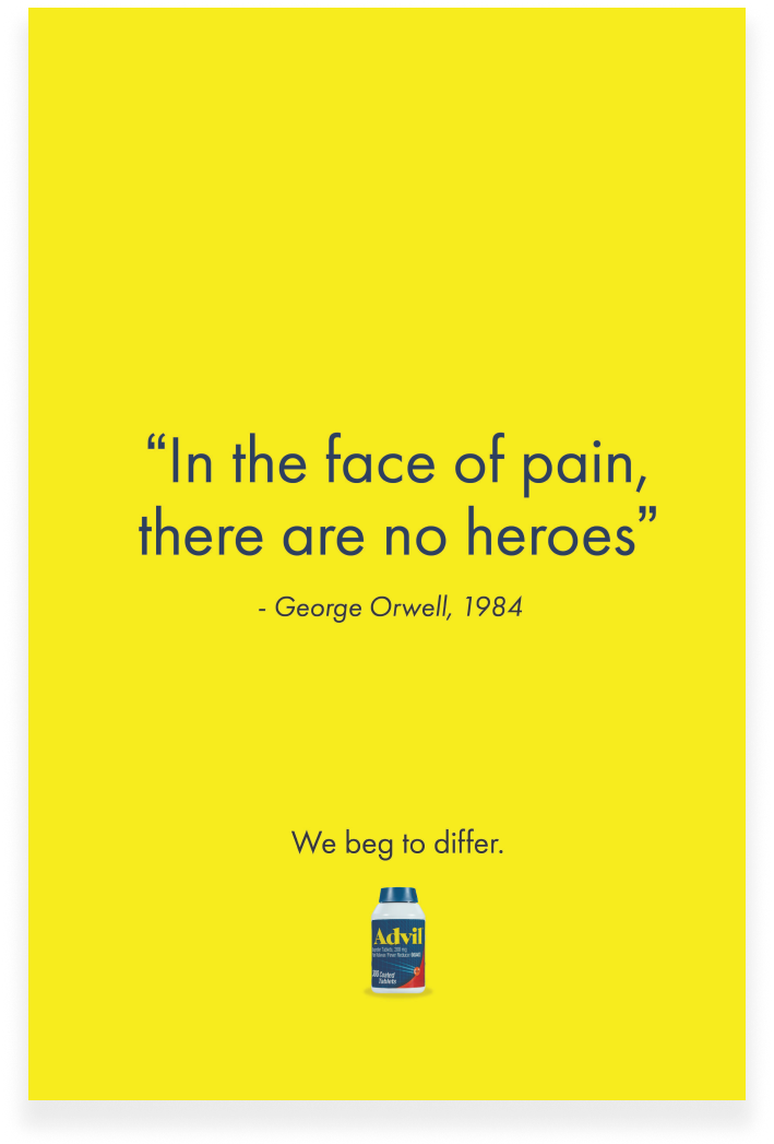
Advil
Brief: Utilizing timeless quotes about pain by notable figures, Advil takes the chance to erase pain within history through its own quotes which speaks with a confidence you can trust as they communicate their promise of delivering pain relief in this straightforward campaign.
Monotype
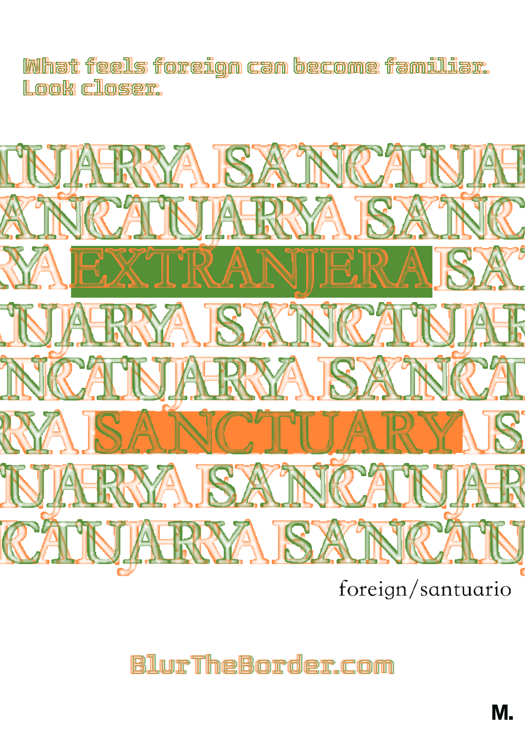
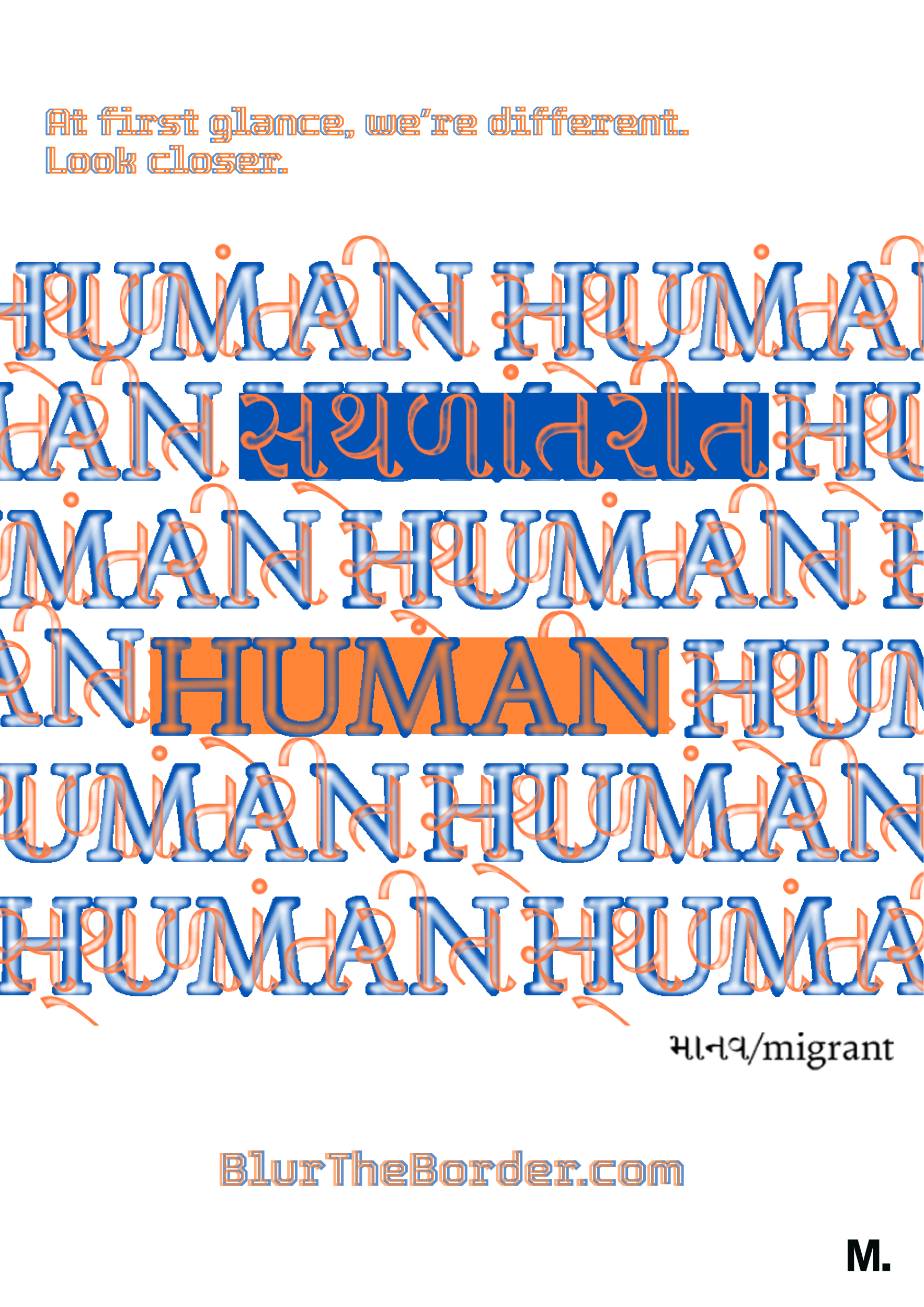
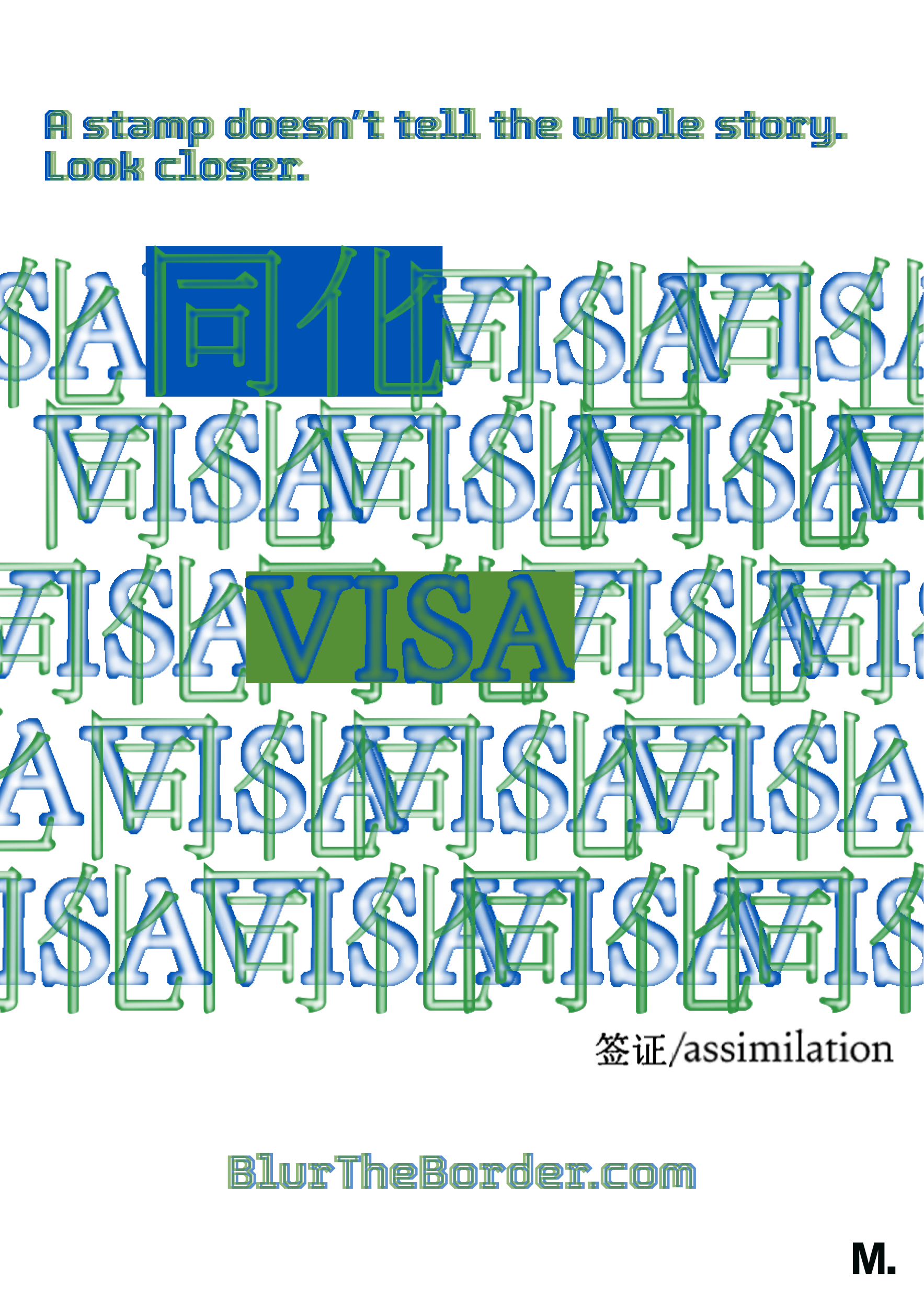
Brief: Reimagine the role of typography in the tension between freedom and law & order, using the latest font technology, font displays/media/carriers, and novel typographic form. Enable the type to become more than just a messenger, and instead an active partaker in the conversation.
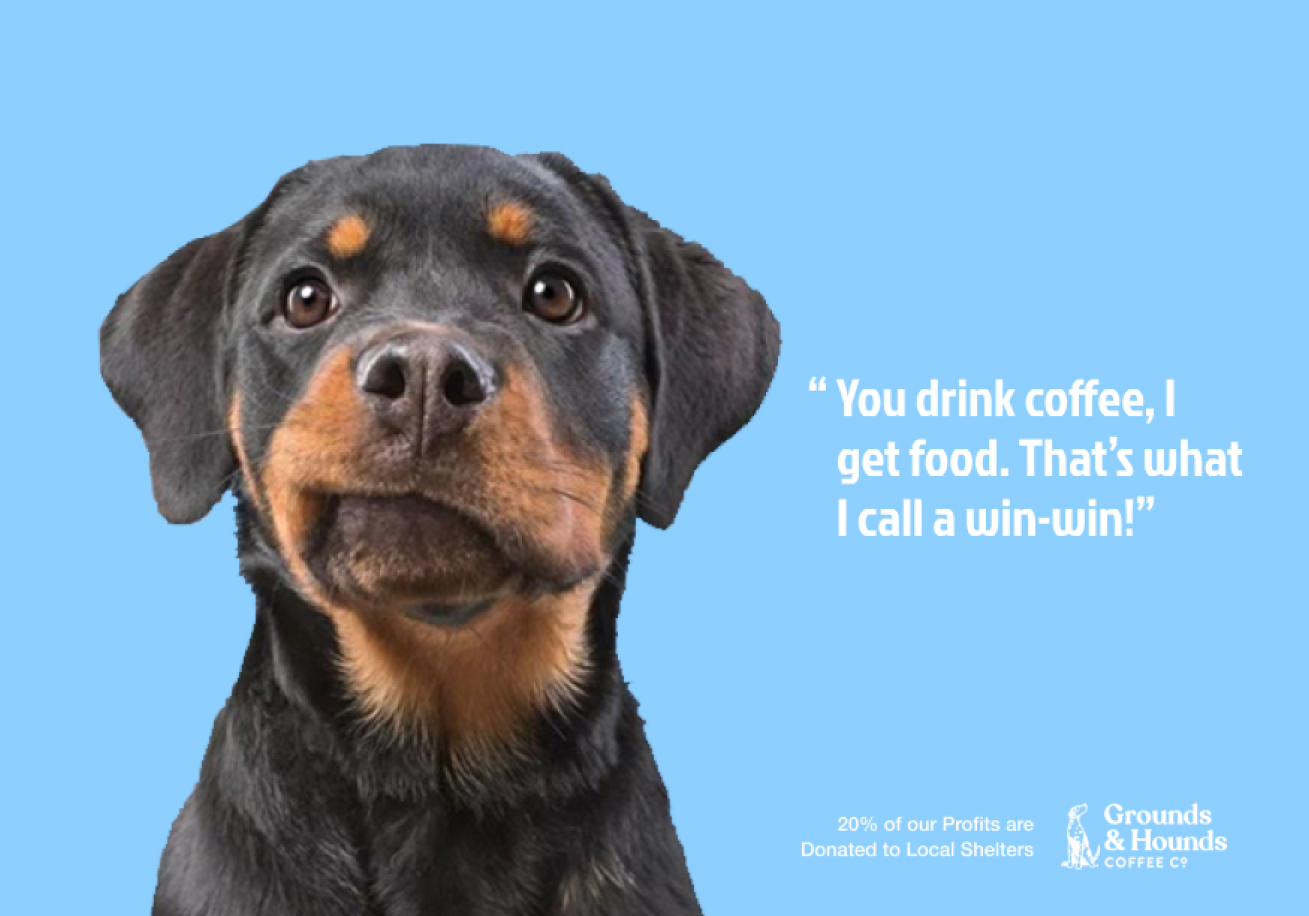
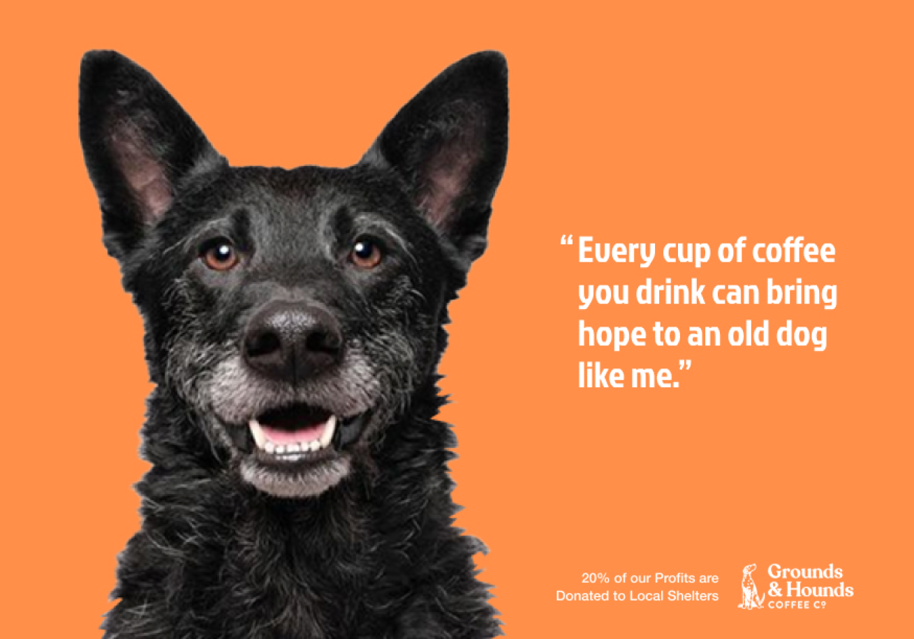
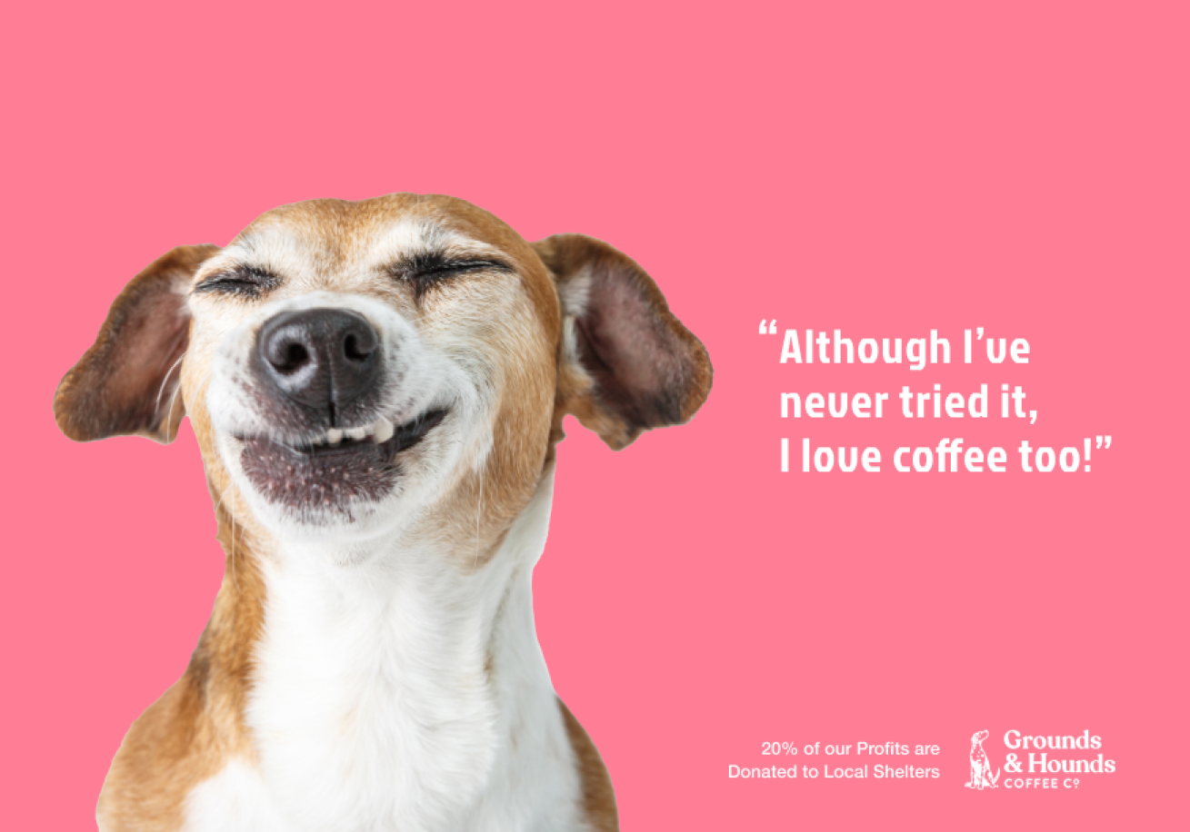
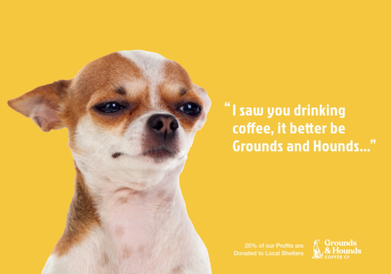
Ground & Hounds
Brief: Utilizing timeless quotes about pain by notable figures, Advil takes the chance to erase pain within history through its own quotes which speaks with a confidence you can trust as they communicate their promise of delivering pain relief in this straightforward campaign.